UnNews:UK parties unveil last-minute campaign posters
| Straight talk, from straight faces | ✪ | UnNews | ✪ | Friday, May 8, 2026, 04:10:59 (UTC) |
| UK parties unveil last-minute campaign posters | 
|
1 May 2015
LONDON -- With less than a week until the British public enter their local church halls and community centres to vote - many of them just using it as an excuse to visit the facilities - the 5 main parties have released campaign posters in a desperate bid to lure more of the public into voting for their party. Political analysis of the posters has shown an insight into how desperate a situation each party considers itself in.
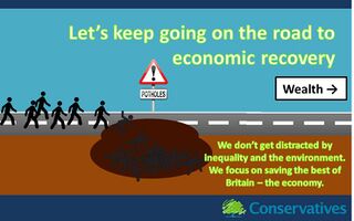
The Conservative poster reveals the flexibility of the Conservative campaign over the election season. A lot has changed from their original poster. The background sky is a lighter shade of blue and the image of the road is taken from a different angle. This shows that the Conservative Party is taking the campaign seriously and is adapting to the concerns raised by the opposition parties by repeating the word "economy" over and over again.
The message of the poster is clear: Vote Conservative and we can keep going as usual knowing that the economic recovery plan is working. Vote anything else and change might happen. As for Britain's actual social and environmental disasters — these are complicated issues and solutions might require money.
Notably, black people make an appearance on the poster, in line with Conservatives' attempt to make inroads among blacks, as stick figures. Stick figures are usually black, so this won't put off traditional Conservative voters. The poster has a noticeable lack of red colour in an attempt to show that there is still a difference between the Conservatives and Labour.
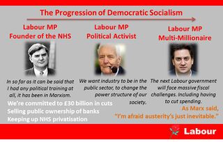
The Labour poster reflects the competence of the Labour Party marketing team. It is convoluted, half of it is plagiarised off Stalin's own posters and, Ed Miliband's face has made an appearance on it. The grey background has also been flagged up as a concern as it may be too dull for a political poster. However, Labour have claimed it is necessary to provide contrast in order for Ed Miliband's face to appear warming.
The message of the poster is twofold:
- Labour is not Blairite anymore. It has moved on into the 1940s, into true democratic socialist ideals. This is shown by the inclusion of two of the most famous democratic socialists from the Labour Party, Tony Benn and Nye Bevan.
- Labour is still Blairite, as Ed Miliband has a property worth £2.3 million with two kitchens and so holds true to the Blairite ideals that everyone in Britain is upper middle class.
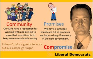
The Liberal Democrats have settled on a more traditional poster addressing the key strength of the Liberal Democrats — that they are weak. The poster includes Nick Clegg's face, just to remind you who he is, and also a yellow background, typical of Liberal Democrat colour schemes.
The message of the poster is that the Liberal Democrats are good at breaking two things. One of them is the barrier between constituents and their MP. The Lib Dem MPs are always warm and friendly and look out for their community. In fact Liberal Democrats are always rushing around doing errands for their electorate and sometimes breaking the speed limit while doing so. The second one of these is promises. The Liberal Democrats break promises off the promise-making tree like there's no tomorrow.
Traditionally the Lib Dems have appealed to intellectuals and students. However, to increase their voting base, they have included the words "it doesn't take a genius to work out our campaign slogan" in order to attract more stupid members of the population.
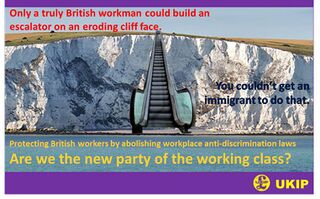
UKIP's campaign poster features the White Cliffs of Dover, Brunel's ingenious engineering masterpiece that prevents low-flying transport planes full of immigrants from ever landing on British soil. UKIP dispensed with most of the words on their poster for greater appeal to Britain's illiterate voters.
The message of the UKIP poster is clear — The beautiful English landscape is a suitable deterrent to prevent people escaping countries stricken with poverty, war and disease from coming to the British Isles. The poster also shows the great triumph of the British construction industry, which recently has become infiltrated by Eastern Europeans who get away without working because of the EU's Health and Safety Political Correctness Nonsense Laws.
UKIP hopes to attract the hard-working, lower-class English Northerners into their voter base and away from Labour's. This is why their poster focuses on presenting UKIP as the party of the working class despite its pledge to give tax cuts to the rich and public services cuts for the poor.
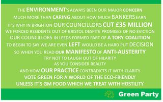
The Greens have finally mustered enough money through busking and a sponsored expedition up Kilimanjaro to fund an election campaign poster. It has been constructed from 100% recyclable materials such as paper, wood, and members' blood mixed with white eco-friendly ink for the writing. They have adhered to the concept of "a thousand words writes a picture" and have wasted no valuable resources producing images on Photoshop.
Their anti-austerity message in their poster separates them distinctly from Labour. After all Labour have never been in a council coalition with the Conservatives. They have made it explicitly clear that where they fail to deliver environmental policies they will deliver anti-austerity policies and where they fail to deliver anti-austerity policies they will deliver environmental ones. Sometimes they will even fail to deliver both.
Their poster targets people who enjoy reading wordy memes on Google Images.
