 |
This page is an archive. The contents have been moved from another page for reference purposes only, and should be preserved in their current form. Discussion or voting on this page is not current. Any additions you make will probably not be read.
|
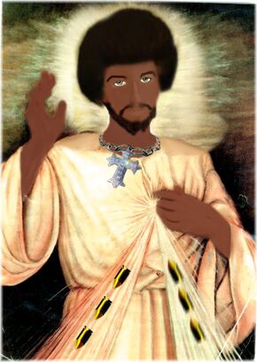
- It doesn't look all that black. Instead, it looks like a messy airbrush of white Jesus. Start over. Add a layer over JC's face/hands and fill it with a uniform and suitable shade of brown. Then lighten/darken that layer to suit the highlights and shading of skin (use google to find appropriate pictures of black people for help). Make sure that you don't colour outside the lines (the present pic does and it kills the effect). Also, if you're going to use a 'fro, use a 'fro. The present pic looks more like he Jheri curl'd but didn't use enough softening cream. --Sir Modusoperandi Boinc! 02:22, 5 March 2007 (UTC)
- It's a little better now, but he's all one tone and should probably have brown or hazel eyes (and what's with the bullets?).--Sir Modusoperandi Boinc! 18:21, 6 March 2007 (UTC)
- Ever hear of the Ghetto? lol, but yeah I don't really mind the one tone I mean it's made to look more like a painting. ----
 CartoonDiablo
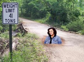
Rosie Pushes the limit
- Yah, while this isn't funny and probably never will be, you need to make that lady darker, so that she blends into the lighting of the background. -- Brigadier General Sir Zombiebaron 20:31, 4 March 2007 (UTC)
- The lasso tool can be evil if used improperly; the edges go all fuzzy. The edges all around Rosie are way too fuzzy. Try putting a pic of a pile of gravel in between the "rosie" layer and the background layer. Then crop the bottom edge of Rosie so that it looks like she's fallen down through the ground and pushed rubble up around her. The "41" doesn't look right (I take it you added the "1"?). Centre it. Also, Rosie is a meme that should die. ...Rosie is a fat hypocritical loudmouth..." was tired years ago.--Sir Modusoperandi Boinc! 20:38, 4 March 2007 (UTC)
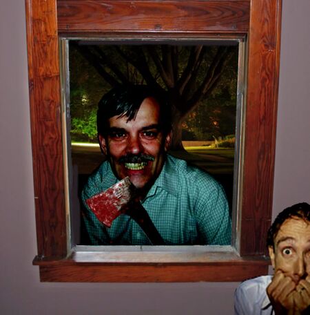
Martin is watching...
- The angle of the axe doesn't look right. I'm trying to picture where his left hand would be and it's not where the axe would end. Try rotating the axe 20 degrees clockwise. Also, axe need more blood. Axe always need more blood. Speaking of axes. /me runs out to woodshed...--Sir Modusoperandi Boinc! 04:18, 1 March 2007 (UTC)
- This should fix it... --~

Jacques Pirat, Esq. Converse : Benefactions : U.w.p.
20:41, 1 March 2007 (UTC)
- The guy in the bottom corner needs to be darkend up to reflect the lighing of the room more, he's currently far to white. -- Brigadier General Sir Zombiebaron 03:39, 2 March 2007 (UTC)
- Fixed --~

Jacques Pirat, Esq. Converse : Benefactions : U.w.p.
14:55, 2 March 2007 (UTC)
- Much better. But why is there so much black space on the canvas? The picture could be shorter, and the whole image could do with some context (ie: where is it?) -- Brigadier General Sir Zombiebaron 05:21, 3 March 2007 (UTC)
- Well, one thing was strangely fixed without any problems. I'll get the background up from the original Martin Edwards picture going, too. --~

Jacques Pirat, Esq. Converse : Benefactions : U.w.p.
15:45, 3 March 2007 (UTC)
- That is soooooo much better. However, I hate to be so picky, but there is a problem with the inside-metal-part of the frame on the left side, where it is beside the canvas. -- Brigadier General Sir Zombiebaron 20:35, 3 March 2007 (UTC)
- Fixed. --~

Jacques Pirat, Esq. Converse : Benefactions : U.w.p.
00:32, 4 March 2007 (UTC)
- Also, you can't see Zb in the background in a trenchcoat and black socks. --Sir Modusoperandi Boinc! 21:05, 3 March 2007 (UTC)
- I probably won't fix that. --~

Jacques Pirat, Esq. Converse : Benefactions : U.w.p.
00:32, 4 March 2007 (UTC)
- If you had mentioned that you intended to post it on VFP, I would have said, "Have the caption about horror, and make the pic Stephen King."...--Sir Modusoperandi Boinc! 05:19, 10 March 2007 (UTC)
Rockin' Greeks
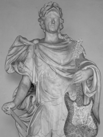
- I came up with this idea at 4am, and I fell of my chair laughing. I'm not sure I did my vision justice...but...you can help! -- Brigadier General Sir Zombiebaron 09:24, 28 February 2007 (UTC)
- Can you apply a suitably "rocky" layer to the guitar? I think it would look more Grecian if it matched the statue.--Sir Modusoperandi Boinc! 09:33, 28 February 2007 (UTC)
- I know less about Photoshop then you think Modus, please explain what you mean. -- Brigadier General Sir Zombiebaron 09:36, 28 February 2007 (UTC)
- Okay, you've got the layer of statue and the layer of guitar, right? Now find a hi-res pic of granite on the interweb, and add it as a layer over the guitar. Play with its transparency so that it's still clearly a guitar, and perhaps adjust the brightness/contrast of the rock layer to make it look more real. Also, try setting the rock layer to "lighten" or "darken" (whichever ends up working best), as that will allow some of the guitar layer to seep through. When in doubt, experiment. --Sir Modusoperandi Boinc! 10:14, 28 February 2007 (UTC)
- Thanks buddy, I'll do that when I get some time. Played around with the filters before uploading it, and the best I could do was grayscale it. But yah, your plan sounds better ;) -- Brigadier General Sir Zombiebaron 23:04, 28 February 2007 (UTC)
- The Greeks had a bunch of gods...I'm thinking that one of them must have been the God of Rock.--Sir Modusoperandi Boinc! 23:23, 28 February 2007 (UTC)
- That could be this guy...since they all look the same...and, all that would take is change to the caption. -- Brigadier General Sir Zombiebaron 23:38, 28 February 2007 (UTC)
If the guitar is granite, this is just a great caption away from being a winner. I suggest something like "Symphona, the Greek goddess of rock (Opera in Roman mythology) was one of the lesser goddesses born to Tethys and Oceanus. She is said to bless those who truly appreciate "a killer riff" by turning herself into a sculpture made out of stone (it is assumed marble). She is considered a lesser goddess because this happened only once." Of course, you can do whatever you want with it, I'm just throwing this idea out there.--<< >> 14:47, 1 March 2007 (UTC)
- Don't forget something about her male followers having mullets, and the females having really big hair. --Sir Modusoperandi Boinc! 16:54, 1 March 2007 (UTC)
- Okay guys. Today I uploaded two new versions. The first one made the guitar look more "rocky" using the patterns in Photoshop CS, while the other version (currently showing) was created using an actual picture of a rock. I'm not sure if it looks that much better, so please tell me how to improve it. Also, I love your caption Brad. -- Brigadier General Sir Zombiebaron 05:19, 3 March 2007 (UTC)
- This pic is better than the one w/the photoshop rock. It just needs a shadow where the hand is grasping the guitar neck and maybe swap out the thing in his right hand for a "granitized" bottle of Jack Daniels. It may be a bit late, but have you considered using a Flying V guitar instead of this one? The "V" is Greek for "rock".--Sir Modusoperandi Boinc! 05:32, 3 March 2007 (UTC)
- At this point I could still probably make it a flying V, although this is the only really high-res guitar picture I could get at this angle. So, if you can find me a source image, I'll make it happen. Also, I tried putting a guitar pick in the other hand, but since the thumb is missing, and I can't make a new one, I just left it. But, at this point, does the guitar look like stone? -- Brigadier General Sir Zombiebaron 06:00, 3 March 2007 (UTC)
- Also, I'm not sure where you want the shadow. You need to speak slowly and clearly Modus. -- Brigadier General Sir Zombiebaron 06:01, 3 March 2007 (UTC)
- Yes, it looks like stone. Since Symphona appears to be lit mostly from below, there needs to be a shadow above the hand on the neck of the guitar; maybe a smaller, not-so dark one below the hand also. This Flying V may work, if you want to change the guitar. There are also the wee details, if you are particularly obsessive, like airbrushing out the strings or lightening the whammy-bar/jack/etc (to make them appear to stick out a bit), but shit like that is up to you. If it was me, I'd do stuff like that...but then I did spent 10+ hours and at least four different versions to put a kitten on a pony.--Sir Modusoperandi Boinc! 06:12, 3 March 2007 (UTC)
- Okay, I'll do that when I have time (sometime this weekend I hope). I also spent like 5 minutes and one version to replace a Cuban revolutionary's face with the face of a zombie, and then like 10+ hours and 5 revisions to turn elephants pink. -- Brigadier General Sir Zombiebaron 06:20, 3 March 2007 (UTC)
- Kudos! Have you considered combining the two? --Sir Modusoperandi Boinc! 06:28, 3 March 2007 (UTC)
- If I knew how to make pink-zombie-elephants, trust me I would. -- Brigadier General Sir Zombiebaron 06:30, 3 March 2007 (UTC)
- Looks miles better with the stone effect but still there's something not quite right. Did you use a stone overlay from the statue itself? That could work. Still, a pretty good job - would go very well in an article. -- Hindleyite Converse 19:47, 13 March 2007 (UTC)
- Try moving the pin/fuse up/out more, so that you can use more of the Wiki symbol (it looks like the symbol is caving in with the pin/fuse in the original location. --Sir Modusoperandi Boinc! 02:44, 26 February 2007 (UTC)
- Why is their blood? Why is the pin in the hole? Why are the fingers causing the sphere to crumble? Why, do I ask? Because, if I'm asking questions, I'm not laughing, and I can assure you I'm not laughing. So, make it so that everything is simple, and then we'll talk. -- Brigadier General Sir Zombiebaron 09:28, 28 February 2007 (UTC)
- Change the Wikipedian idiot writing so it reflects the original "American Idiot" writing. [1] And maybe a different caption. --AAA! (AAAA) 07:08, 2 March 2007 (UTC)
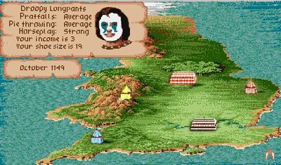
This is probably the best potatochop I've done (which may not be saying much). Anyone think it can make Featured status? It may be one of those jokes funny to people who know Defender of the Crown and bewildering to the remaining 95 percent of humanity.--Procopius 00:50, 24 February 2007 (UTC)
- Sweet. Was a class game too....so many hours of my life wasted on it. :) I'd think about adding a little more detail to the bottom of the page, sure you could expand both the image AND the gag in one go. Nice bit of work. -- Sir Mhaille
 (talk to me)
- Thanks. (Personally, I could never master the tournament part.) Regarding the detail on the bottom -- anything specific?--Procopius 01:04, 24 February 2007 (UTC)
- As someone who's never played whatever it is that you're talking about I can honestly call myself an expert. It needs a bear on a unicycle and, due to the general littleness of the sprites, the tents could probably use colours that pop. And my cotton candy fell on the ground. And it was made with real cotton. --Sir Modusoperandi Boinc! 01:07, 24 February 2007 (UTC)
- Wasn't there a control panel at the bottom of the screen? -- Sir Mhaille
 (talk to me)
- I don't think there was -- I stole the screen shot from an Amiga website.--Procopius 14:37, 24 February 2007 (UTC)
- /me reminisces fondly while gazing through rose-tinted glasses at Amiga 500 in its original box on boxshelf...--Sir Modusoperandi Boinc! 14:53, 24 February 2007 (UTC)
- I've never played DotC but I love this pic, especially the 'shoe size' bit. -- Hindleyite Converse 12:23, 24 February 2007 (UTC)
- Speaking of shoe size...the area behind the "si" in "size" is a different colour than the rest, and the "is" and "19" are too close. Also, the clown looks like Jack Black. I would have pointed these out earlier but I try not to pay attention to things.--Sir Modusoperandi Boinc! 14:19, 24 February 2007 (UTC)
- Thanks. I can correct the first two things, but no potatochop can correct a Jack Blackian appearance.--Procopius 14:37, 24 February 2007 (UTC)
- Thanks for the suggestions. Very helpful. I fixed the text at top, and added a white tassel (of sorts) to the tent at the bottom. Does it look OK? If so, I'll add to the other tents; if not, I'll remove it.--Procopius 16:04, 24 February 2007 (UTC)
- How much you wanna bet Zombie will vote against this because there's text in the image (nice pic, BTW).--<<
 >> 23:14, 24 February 2007 (UTC)
- Well, the joke pretty much is the text... --Sir Modusoperandi Boinc! 00:27, 25 February 2007 (UTC)
Fluffy Attack
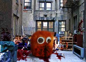
- There should be more carnage. It should look like the scene from Akira right after that kid blew up the hospital attendants: blood, limbs, etc everywhere. I think the more violent the picture, the funnier it will get.--<<
 >> 14:00, 17 January 2007 (UTC)
- Bloodified, with added limb in mouth. Didn't want to overdo it, or it'd look ridiculous. --ynnaD 15:40, 17 January 2007 (UTC)
- In my opinion, there shouldn't be a limb in his mouth, because it makes it look like he just finished attacking someone. All the other carnage is fine, because it gives the eery feeling that after attacking whoever, the Fluffy just sits there. -- §. | WotM | PLS | T | C | A 01:53, 19 January 2007 (UTC)
- Hmm, I happen to agree with the eerie waiting thing, so I removed the foot, and added a blood trickle to indicate it's been there a while. I was thinking of adding a flashlight effect, ie changing the scene to night and having a light illuminate the fluffy, and a bit of carnage. What do you think, would it work, or should I leave it as it is? --ynnaD 12:22, 19 January 2007 (UTC)
- Go ahead and give it a shot, I'd have to see it if it's creepy enough, but right now this is a brilliant image. -- §. | WotM | PLS | T | C | A 03:40, 20 January 2007 (UTC)
- I decided against it; it'd be too much work removing the daylight reflections from the windows, and adding proper reflections and shadows for the flashlight. --ynnaD 17:03, 23 January 2007 (UTC)
Terrorism Prevention
| Please Help this Picture
|
The United States Government recently spent 2.6 billion dollars to prevent further terrorism. Image credit: Gneomi
Nominate - discuss this image
|
|
- Suddenly accrossed my mind. Not a really extravagant image, please comment. Cheers - It's gneomI 06:39, 14 January 2007 (UTC)
- The signs don't really look like signs, and the sign pole doesn't look like a pole. Try 'chopping in the pole from a pic of a streetlamp, and take a roadsign and swap the text.--Sir Modusoperandi Boinc! 06:43, 14 January 2007 (UTC)
- A new one. I'm still not sure about the text though. Maybe I should put a strange map on it, what do you think? Cheers - It's gneomI 07:21, 14 January 2007 (UTC)
- Maybe "This exit: Not Pentagon" and "Real Pentagon: 800 Miles", or somesuch.--Sir Modusoperandi Boinc! 09:56, 14 January 2007 (UTC)
Cool? :P Please say if it's not, hehe. It's gneomI 10:14, 14 January 2007 (UTC)
- I think you should go for a billboard that says "Looking for the Pentagon? Well to bad this isn't it." as the main text with as aubheader saying "REAL Pentagon - exit at exit 56A on Highway 35E. Turn left at IHOP." or something like that.--~

Jacques Pirat, Esq. Converse : Benefactions : U.w.p.
21:56, 15 January 2007 (UTC)
- Do Amercian IHOPs serve Freedom Toast?--Sir Modusoperandi Boinc! 22:08, 15 January 2007 (UTC)
- I couldn't tell you. I've never been to an IHOP, but by federal law(IIRC) they should be at least serving Freedom toast around the DC area. --~

Jacques Pirat, Esq. Converse : Benefactions : U.w.p.
22:44, 15 January 2007 (UTC)
- Simple but effective. Good joke. -- Hindleyite Converse 11:43, 3 February 2007 (UTC)
Dreamvaders
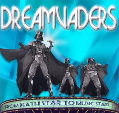
- There was this great image that looked so Darth Vader Vegas, so I played while baby napped. Struggling with the marquee lettering. Dame
 GUN PotY WotM 2xPotM 17xVFH VFP Poo PMS •YAP• 21:15, 8 January 2007 (UTC)
- This is great. try doing each word separately - that might make the changes in text size less noticable. Maybe make other two vaders in the back different colours. no, yuo
 chat 11:44, 9 January 2007 (UTC)
- Its all one picture of Vader. And the fat-one is obviously squashed. You need diffrent Vader images, or even one of Anikin and one of Death-Scene-Vader (without the mask). --Brigadier General Sir Zombiebaron 06:34, 19 January 2007 (UTC)
- Hah, I love this image, particularly the fat one. The text at the bottom doesn't look quite right, though: it needs a little more tweaking to be in line with the billboard thing. -- Hindleyite Converse 11:55, 21 January 2007 (UTC)
- Try using type on a path if you're using photoshop CS1 or greater to fix the text. I like it though. Maybe make the darth vaders look less like clones. --ynnaD 12:49, 21 January 2007 (UTC)
Mike's Masterwork
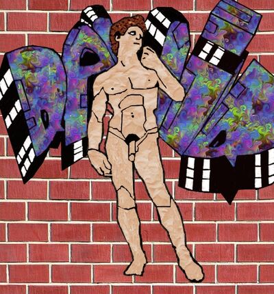
- This is a little better, I think. I've actually found pictures of graffiti on brick that you can't see the brick lines through very well. Apparently, if it's new work it's much harder. --//Dynamo// 05:07, 7 January 2007 (UTC)
- This really did take talent. If I were wearing a hat I would take it off for you. The genitalia, while of wishful size is a bit "large" for David. And would Michaelangelo have a "flesh" colored David, or would it be just an edgy outlines or tone-on-tone whites? Dame
 GUN PotY WotM 2xPotM 17xVFH VFP Poo PMS •YAP• 21:19, 8 January 2007 (UTC)
- I tried the white tones, but it looked terrible as graffiti. RE: David's manhood, I'm sure he's glad you noticed. --//Dynamo// 08:02, 9 January 2007 (UTC)
Mike's early work
- First attempt at homemade graffiti. Thanks for pointing me to GIMP, I think I'm in love with it. --//Dynamo// 12:59, 6 January 2007 (UTC)
- The cracks should be visible in the graffiti. --
 Alksub - VFH CM WA RV {talk} 20:59, 6 January 2007 (UTC)
- It doesn't scream Michaelangelo, and it doesn't look like graffiti, which generally has an airbrushed quality, rather than texture (a la).--Sir Modusoperandi Boinc! 21:09, 6 January 2007 (UTC)
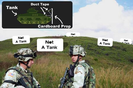
Modern Camo Mk.2
- I came up with the idea and did it in paint, The Llama Lover took it and ran. Incidentally, I like his better. --//Dynamo// 07:08, 6 January 2007 (UTC)
- Better. The schematic could be a bit bigger and there should be shadows of some sort near the actual signs.--Sir Modusoperandi Boinc! 07:21, 6 January 2007 (UTC)
- Can do! I'll fix that part and upload a newer version. You'll see it sooner or later --The Llama Llover!!! 07:56, 6 January 2007 (UTC)
- minor things: make the font on the schematic the same, maybe add some dirtiness to the cardboard (or darken it a bit) and faint whiffs of smoke coming from behind the tank camoflage? no, yuo
 chat 11:39, 9 January 2007 (UTC)
- You might want to use the perspective tool in GIMP (I believe PS has something like that) so that it doesn't look so plain. Oh, and also what "No, yuo" said about dirt - make sure you redo the dirt pattern per tank. A blur filter would be nice, too. I would be able to do those in GIMP with the original image, without the "Not a tank" signs.
- P.S. I love the concept =D --thematrixeætsyou, the ass kicker (talk) (flames) 02:39, 22 January 2007 (UTC)
- Yeah, the concept's great. I like the way the guy at the front's like: "I can't see no tanks. Can you?" "Uh uh." -- Hindleyite Converse 18:54, 24 January 2007 (UTC)
Rock, Paper, Airstrike
- I dreamed this up for an article by Bradaphraser. I'll probably insert one more paper airplane for an odd 3, or will remove one depending on opinions here. What do you think? -- §. | WotM | PLS | T | C | A 06:41, 3 January 2007 (UTC)
- There should only be one paper airplane (it's "paper", not "papers"), and the paper airplanes are a bit too blurry. I shouldn't have to squint to get the joke. Also, and airstrike is a plane bombing something (which would technically make this pic better if the plane was dropping a bomb on a paper boat or origami swan, although I don't think it'd work).--Sir Modusoperandi Boinc! 07:20, 3 January 2007 (UTC)
- Check. One paper airplane, less blur. Anyone else? -- §. | WotM | PLS | T | C | A 20:32, 3 January 2007 (UTC)
- I like Modus's "Airstrike on a paper boat" idea, so maybe that means you should make it? --Brigadier General Sir Zombiebaron 23:24, 6 January 2007 (UTC)
- I will when I get a little more free time. -- §. | WotM | PLS | T | C | A 04:47, 11 January 2007 (UTC)
- A B-52 coming toward the "camera", dropping Fat Man on a dinky paper boat on a calm sea might work (the tricky bit will be making the boat not too big and not too small).--Sir Modusoperandi Boinc! 05:01, 11 January 2007 (UTC)
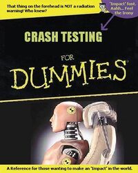
Crash Testing for Dummies
| Please Help this Picture
|
A badly done MS paint photo for the cover of an UnBook I am working on, inspired by an idea I got reading some other UnBook. Image credit: Arachnid
Nominate - discuss this image
|
|
- The "crash testing" text needs to look like it looks on most real "for dummies" books (eg: bigger, on an angle and leaning to the right. Like some of these). A better dummy pic would be one with the dummy thrown forward, like a snapshot in the middle of an accident (the dummy currently looks almost comfortable).--Sir Modusoperandi Boinc! 01:32, 31 December 2006 (UTC)
- Keep in mind this was done in MS paint. In about 5 minutes. but the Crash Testing font won't change. --Arachnid
- Get GIMP, Photoshop, Jasc PSP; anything but MSPaint. Using Mspaint to 'chop is like wearing mittens while typing. --Sir Modusoperandi Boinc! 01:43, 31 December 2006 (UTC)
- Or Strong Bad typing with gloves on. --AAA! (AAAA) 07:37, 31 December 2006 (UTC)
- Add that little mascot guy, if you can. --AAA! (AAAA) 07:35, 31 December 2006 (UTC)
- The mascot guy is in the top right corner. Add a yellow background on the bottom section. --Kitty 18:43, 4 January 2007 (UTC)
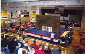
Paint Drying
- Have someone painting part of the fence and a bucket o' paint on the stage, maybe. Perhaps crop a bit and add a "Caution: Wet Paint" sign.--Sir Modusoperandi Boinc! 22:39, 30 December 2006 (UTC)
- Done, on both counts.--YnnaD 23:20, 30 December 2006 (UTC)
- You'll need to crop a bit, too (as it is, the paint sign is far too small to be legible). Maybe add some paint coloured foot prints to go along with the splatter.--Sir Modusoperandi Boinc! 23:24, 30 December 2006 (UTC)
Fucking Amazing Smileys
This was inspired by the page me. I'm very new to the art of the Photoshop -- fortunately, if this looks like a horrible mess, I can claim it's part of the joke.
- Hahaha. It's funny, but you should clean it up a little bit. --Prolix 22:33, 24 December 2006 (UTC)
- What do you mean by "clean it up"? I'm not yet "down" with the "lingo" like all you "hip" "kids".--Wyattj 11:27, 26 December 2006 (UTC)
- It's messy...for example; the black lines around the faces don't form a perfect circle, and they're, well, messy.--Sir Modusoperandi Boinc! 11:36, 26 December 2006 (UTC)
- Oh - you mean that they should be drawn with a curve tool, not freehand? Okay, I'll do that for the next incarnation. The black lines were drawn with PSP's Circle tool so I'm not sure how to get them any more circular. Unless I'm using the wrong tools for the job.--Wyattj 15:15, 27 December 2006 (UTC)
- What I think they meant was that the lines are jagged, try turning on antialiasing if you have it in options, if not then blur it a little so it looks smoother. --YnnaD 17:47, 30 December 2006 (UTC)
- Working in a higher resolution than your save resolution works too, as some graphics programs draw circles as a series of straight lines (higher res means circles made up of more lines, making them more circley). Work in 600x600, but save as 300x300, for example (note that this can end up making text look like shit. You'll probably have to experiment a bit to find what works best).--Sir Modusoperandi Boinc! 07:25, 3 January 2007 (UTC)
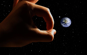
Angry God
I found this image on Uncyclopedia:How To Be Funny And Not Just Stupid THE IMAGE VERSION, which they claimed was "funny", and the creator of this image says it's his best image yet [1], so I thought I'd give it a try. What do you think? (In case you don't know, it's God flicking the earth) --AAA! (AAAA) 10:26, 21 December 2006 (UTC)
- Brighten up the Earth a bit and flip the hand to the opposite side (currently the Earth is lit from the left, and the hand from the right). If the original pic had both space and the earth/moon you can just cut & mirror the hand/space. --Sir Modusoperandi Boinc! 05:46, 22 December 2006 (UTC)
- I've flipped the image, yet it doesn't look any better. Also, this image should be converted to PNG. Look around the black area. --AAA! (AAAA) 04:52, 24 December 2006 (UTC)
- Not the whole image, just earth/moon or the hand. See how the hand is lit from one side and the earth is lit from the other?--Sir Modusoperandi Boinc! 05:33, 24 December 2006 (UTC)
- Can't. All I have is MS Paint. --AAA! (AAAA) 07:31, 24 December 2006 (UTC)
- I changed it, but it doesn't look that much better. Also it's a PNG now, for whatever reason. --Prolix 09:04, 24 December 2006 (UTC)
- Would God just do this if God were really PO'd? Or would God do this if God were merely ticked off. Personally I like the image. Dame
 GUN PotY WotM 2xPotM 17xVFH VFP Poo PMS •YAP• 02:14, 4 January 2007 (UTC)
If you look near the stars, you can see some unwanted pixels around it that was caused by the original JPEG image. Can someone fix this? --AAA! (AAAA) 11:31, 6 January 2007 (UTC)
- I can't see what you're talking about.--Prolix 14:28, 6 January 2007 (UTC)
- Look at this version with a red background. You see those black pixels surrounding the white stars? They should be fixed. --AAA! (AAAA) 05:14, 11 January 2007 (UTC)
- All done. Anything else? -Prolix 01:21, 16 January 2007 (UTC)
- Nope. I think we're all set! --AAA! (AAAA) 11:33, 18 January 2007 (UTC)
Leisure Suit Abstinence
| Please Help this Picture
|
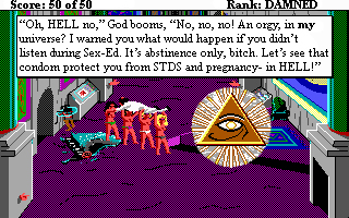
Created with a No Child Left Behind grant, Leisure Suit Abstinence was first in a line of next-generation educational computer games. However, its Digital Rights Management was highly controversial, as it released a system-crippling virus if the player did not first enter into the EULA. Image credit: Prolix
Nominate - discuss this image
|
|
Well, the caption could be better... Prolix 01:23, 18 December 2006 (UTC)
- Okay, its a commonly accepted rule that images on VFP are voted for on image value, not words within them. And the image is awesome, to someone who played Leisure Suit Larry. Well kinda. I dunno really. Cause it requires the speech bubble to make sense. Without it the bubble it would just by that Mason light thing. Yah, and what's with the Mason light eye thing being God? Anyway, if you want it to be featured the point needs to come across without words. as the joke should be an image joke. --Sir Zombiebaron 07:53, 21 December 2006 (UTC)
- Okay, didn't know that. Prolix 20:35, 21 December 2006 (UTC)
- I saw this a while back, and freakin' cracked up. The caption within the image is great, but what image did you photoshop to make this? What was the original? -- §. | WotM | PLS | T | C | A 04:07, 22 December 2006 (UTC)
- I took a screenshot from the end of Leisure Suit Larry 2 and then added that pyramid from Eye of Horus. Prolix 05:34, 22 December 2006 (UTC)
- Is there a link to the original image? Or did you take the screenshot yourself? Either way, I love it. -- §. | WotM | PLS | T | C | A 22:45, 23 December 2006 (UTC)
- I found it on Google someplace. Why? --Prolix 22:39, 24 December 2006 (UTC)
- To be fair, it's an illuminati symbol, not a masonic one. It IS on masonic temples, but only because of the illuminati infiltration of that organization. --//Dynamo// 09:41, 6 January 2007 (UTC)
I believe the pic to be from the 1989 game 'Eye of Horus' --Ctrl-Alt-Elite 16:07, 13 January 2007 (UTC)
Nuclear Xmas Pudding
- Boomshakalak!!!! Given the current craze for christmas cards amongst Uncyclopedians I made my very own.... -- Sir Mhaille
 (talk to me)
- Nice. Prolix 00:27, 18 December 2006 (UTC)
- Very good. That's what you get when you use gunpowder flavour Christmas pudding. Merry Xplosionmas. -- Hindleyite Converse 15:39, 18 December 2006 (UTC)
The People's State of Michigan
- Please tell me your opinions about this pathetic little image. --DarthMichigan- ダアスミシガン 00:23, 14 December 2006 (UTC)
- I don't acctually know anything about Michigan, other then that it is in the US, and is South of me, but this doesn't even regester on the "Zombiebaron Likes This" scale, sorry buddy. --Sir Zombiebaron 02:45, 14 December 2006 (UTC)
- what's it for? some context would help.no, yuo
 chat 11:25, 15 December 2006 (UTC)
- I made it as a state flag for Michigan. It's on Michigan's Uncyclopedia article
- I don't know why, but I like it.


 02:17, 4 January 2007 (UTC)
T3h ub3r 1337 h0m3 1mpr0v3m3tn st0r3
.
- It's not really your fault, but as a non-leet speaker, that's just really hard to read. It works, but I've got a headache now.--Sir Modusoperandi Boinc! 06:08, 13 December 2006 (UTC)
- Maybe it needs something 1337 out front, for sale like? I dunno, it doesn't seem to have "it", humor wise. --Sir Zombiebaron 02:38, 14 December 2006 (UTC)
- It also fo' sure needs an article. --Sir Zombiebaron 02:43, 14 December 2006 (UTC)
- This image is well leet.
What? It's a bright image. -- Hindleyite Converse 15:40, 18 December 2006 (UTC)
- Please...no..more..leet... Sorry; I just despise leet. --AAA! (AAAA) 01:09, 19 December 2006 (UTC)
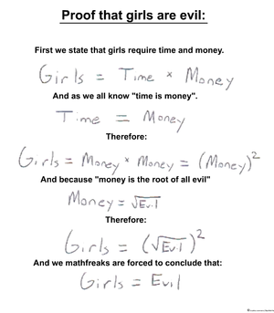
Reason mathfreaks give away to explain their fear to women.
.
- Self Nomiate!-- Walter Humala - Emperor of West Wikipedia
 |wanna Talk? 13:19, 12 December 2006 (UTC)
- Did you want VFP? Oh well, apart from this being not original, you could do the concept in LaTeX, that'd make it look better.no, yuo
 chat 17:14, 12 December 2006 (UTC)
- HAHA!!! got busted ...lol!Walter Humala - Emperor of West Wikipedia
 |wanna Talk? 00:56, 13 December 2006 (UTC)
- NO. --Sir Zombiebaron 02:46, 14 December 2006 (UTC)
Not original - [3] --AAA! (AAAA) 01:14, 19 December 2006 (UTC)
Suicide
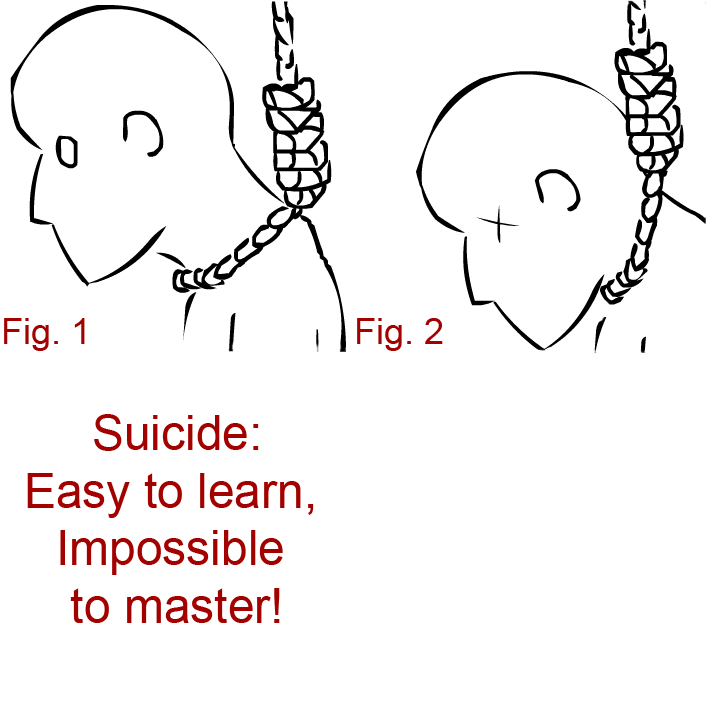
Well, whatever. I haven't seen any animated images so I'm not sure if they qualify. Prolix 18:43, 9 December 2006 (UTC)
- Ahh! Mine eyes! Mine beautiful eyes! Animated pics don't do it for me; the three frame effect annoys. The concept is okay, however. Rejiggered, it might work better as a three panel comic that's an ad for suicide. Which is perfect timing, as it's Christmas.--Sir Modusoperandi Boinc! 21:42, 9 December 2006 (UTC)
- Personally, I'm not in favour of the use of Arial here.
Use Radion Automatic next time. Try something more typewriterish, I don't know. -- Hindleyite Converse 15:42, 18 December 2006 (UTC)
I'm not feeling this anymore. Prolix 05:38, 22 December 2006 (UTC)
MMOrphine
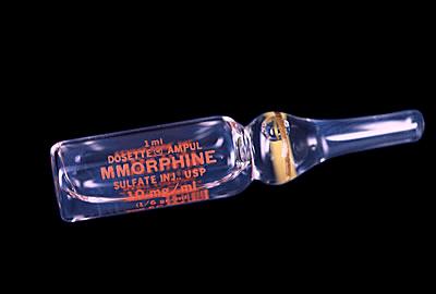
Easily the best picture I've ever done, especially since it began as a spelling error. I know there's something more I can add to it, though. Also, ain't their a guy on here named Morphine-somethin'? Just curious.--The Jeff Killer 03:23, 7 December 2006 (UTC)
- Yes, it funny. But The joke isn't apparnt (I missed the spelling error, silly me), and the text is hard to read. Finnally, the joke is purely textual. --Sir Zombiebaron 18:23, 8 December 2006 (UTC)
- Ah yes, because I forgot that no one on here has an IQ over 80.--The Jeff Killer 23:49, 8 December 2006 (UTC)
- What's IQ mean?--<<
 >> 00:26, 9 December 2006 (UTC)
- Intelligence Quotient, something of which you must have a severly low score of.--The Jeff Killer 02:05, 9 December 2006 (UTC)
- I try to keep mine around room temp, which is easy because here, in whatever country it is that I am from, it's all metric...and I'm not a fan of the pic, but that's because I don't play MMORPGQXX'S. Now, if it was UnMorphine... --Sir Modusoperandi Boinc! 03:13, 9 December 2006 (UTC)
- I like this picture, although I didn't see the joke right away. -- Codestream 02:59, 9 December 2006 (UTC)
- How would UnMorphine be funny?--The Jeff Killer 16:52, 9 December 2006 (UTC)
- Modus - to take the edge off drama? --—Braydie 16:55, 9 December 2006 (UTC)
- I thought that was what Admin was for.--The Jeff Killer 17:00, 9 December 2006 (UTC)
- I never said that UnMorphine would be funny. It would be real, man. If MMorphine is for WoW addicts, then UnMorphine is for Uncyc addicts. Like me. --Sir Modusoperandi Boinc! 19:15, 9 December 2006 (UTC)
- Featured pictures have to be funny. Right?--The Jeff Killer 19:42, 9 December 2006 (UTC)
- Oh, you didn't say you wanted to take a run at VFP. If there are enough WoWers here, maybe (but in that case, aren't you pitching to an audience that's playing a MMORPG, rather than being here?)--Sir Modusoperandi Boinc! 21:39, 9 December 2006 (UTC)
- Are you in some weird case of denial? This site attracts MMOers like flies to a steaming pile of <beep>.--The Jeff Killer 22:01, 9 December 2006 (UTC)
- I just don't hang around with that crowd, I guess. They're always stealing my lunch and putting into their bag of holding. Bastards.--Sir Modusoperandi Boinc! 22:30, 9 December 2006 (UTC)
- That's what my miracle drug is for; getting rid of those "bastards".--The Jeff Killer 00:54, 10 December 2006 (UTC)
- Ummm...hate to break it to you but Morphine kills pain. As of yet, the only way to use it to make someone dissapear is called an "overdose". Oh, and I take offence to you refering to my IQ level as if it were a bad thing. --Sir Zombiebaron 02:49, 14 December 2006 (UTC)
- Just because the word "morphine" is in it doesn't mean it has all the same effects. Learn your fictional medicine, fool!--The Jeff Killer 03:47, 14 December 2006 (UTC)
Agent Orange
I'ma gonna use this for orange --no, yuo  chat 14:58, 5 December 2006 (UTC)
- Haha... well, the hat looks a bit weird...--<<
 >> 17:46, 5 December 2006 (UTC)
- That's because they don't make hats for oranges, and people hats don't fit right. Obviously.--Sir Modusoperandi Boinc! 19:22, 5 December 2006 (UTC)
- That, and i'm rubbish at drawing. I changed the brim of the hat, it looks a bit better now. no, yuo
 chat 13:06, 6 December 2006 (UTC)
- Yes, that does look better. And it's still really funny (but then, the things I think are funny don't always do well at VFP... oh, the humanity!)--<<
 >> 14:39, 6 December 2006 (UTC)
- Hey, me too. And Zb. And just about everybody else here. VFP is a harsh mistress.--Sir Modusoperandi Boinc! 15:22, 6 December 2006 (UTC)
- Are you refering to my best picture ever again, cause you all know you love it! --Sir Zombiebaron 18:26, 8 December 2006 (UTC)
- I pass on my crown and mantle to you, my son. -- Sir Mhaille
 (talk to me)
- Ummm...maybe there is a reason that the orange isn't...well....orange, but its beyond me. Aswell, the wierd star thing in the middle of its face is wierd. --Sir Zombiebaron 18:26, 8 December 2006 (UTC)
- I think he's going for a black-and-white noir film (old detective story) look. If you don't know what that is, watch "Dead Men Don't Wear Plaid". You'll be glad you did. Anyway, the "star thing" is the part where the stem connects with the orange. That's just what I thought, though. I could be way off-base.--<<
 >> 22:42, 8 December 2006 (UTC)
- I like it, quite different to a lot of stuff on VFP, which I like too. -- Sir Mhaille
 (talk to me)
- Oh yes, the animated thing is quite "in" these days. But this image just doesn't "hit me" on a gut level... --Sir Zombiebaron 20:57, 10 December 2006 (UTC)
- eh? Try eating it. --no, yuo
 chat
chat
- Yes, i was going for a film-noir well thingy, and the cross thing is, as bradaphraser said, the stem connectory bit. it was supposed to look a bit like an eye I suppose, but was really the juxtaposition (if you will) of agent and orange in something other than a defoliant use in 'Nam. oh well. i'll VFp it, and see where it goes. no, yuo
 chat 21:05, 10 December 2006 (UTC)
- well, down the tubes... ZB suggested it needs something more, but what? a tired tie and grubby shirt? no, yuo
 chat 08:51, 11 December 2006 (UTC)
- Oh god yes! Now a cigar or ciggarrette and WHABAM I love it! :) --Sir Zombiebaron 02:51, 14 December 2006 (UTC)
- I'll try, but i'm not sure where the hell i'll put it... no, yuo
 chat 18:33, 14 December 2006 (UTC)
- I don't think it matters. A folded sports-coat over the "shoulder" and a cigarette that's in one of the holes in the face would just complete this bizarre picture.--<<
 >> 19:46, 14 December 2006 (UTC)
- this is getting a bit strange. Now i'm not sure where to put this sports coat...no, yuo
 chat 11:22, 15 December 2006 (UTC)
Try to make it look like the main character from A Clockwork Orange, so it has a double meaning. --~ 
Jacques Pirat, Esq. Converse : Benefactions : U.w.p.
23:46, 11 December 2006 (UTC)
- Hah, that's cool. I think the collar and cigarette give it that edge. I also like the sepia(ish) tone. A VFP contender, methinks. -- Hindleyite Converse 16:00, 18 December 2006 (UTC)
- I love how this has improved... the additions really improve it. This would have my vote now -- sannse<staff/> (talk) 09:39, 19 December 2006 (UTC)
- Thanks for the helpful comments. What was a really stupid idea is now a good-lookin stupid picture. i've vfp'd it:no, yuo
 chat 14:47, 21 December 2006 (UTC)
 CartoonDiablo
 02:14, 1 March 2007 (UTC)

![]() >> 14:47, 1 March 2007 (UTC)
>> 14:47, 1 March 2007 (UTC)
 God save him!(God exists?)
  | wanna Talk? 01:18, 26 February 2007 (UTC)
 (talk to me)
 (talk to me)
 >> 23:14, 24 February 2007 (UTC)
 >> 14:00, 17 January 2007 (UTC)


 GUN PotY WotM 2xPotM 17xVFH VFP Poo PMS •YAP• 21:15, 8 January 2007 (UTC)
 GUN PotY WotM 2xPotM 17xVFH VFP Poo PMS •YAP• 21:19, 8 January 2007 (UTC)
 chat 11:39, 9 January 2007 (UTC)
 (talk to me)
 chat 11:25, 15 December 2006 (UTC)
 |wanna Talk? 13:19, 12 December 2006 (UTC)
 chat 17:14, 12 December 2006 (UTC)
 |wanna Talk? 00:56, 13 December 2006 (UTC)
 >> 00:26, 9 December 2006 (UTC)
![]() chat 14:58, 5 December 2006 (UTC)
chat 14:58, 5 December 2006 (UTC)
 >> 17:46, 5 December 2006 (UTC)
 chat 13:06, 6 December 2006 (UTC)
 >> 14:39, 6 December 2006 (UTC)
 (talk to me)
 >> 22:42, 8 December 2006 (UTC)
 (talk to me)
 chat 21:05, 10 December 2006 (UTC)
 chat 08:51, 11 December 2006 (UTC)
![]()
