 |
This page is an archive. The contents have been moved from another page for reference purposes only, and should be preserved in their current form. Discussion or voting on this page is not current. Any additions you make will probably not be read.
|
Dr. Torvaldstein and Stallgor
- I'm no fireworks genius, but I did what I could. There may be some discrepincies due to how I erased it... --- Jaques Pirat IS NOT FRENCH! TP, F@H 22:16, 19 July 2006 (UTC)
- So it's supposed to be fireworks? Perhaps a Google search for pics of fireworks would help. As long as you saved a copy of the pic with layers intact subsituting one of these for the background shouldn't be too much trouble. Correcting the lighting, on the other hand...Also the people are sized different (one too big, or the other too small), maybe try switching them around too (one's getting poked in the head with a pen). I'd be able to offer a better critique but I have no idea what I'm doing. Maybe it's better to just ignore what I say. Or do the opposite. I'm not sure. It probably doesn't help that I don't "get" the page: I'm just not that genre of geek. Modusoperandi 07:48, 20 July 2006 (UTC)
- No I edited it in Macromedia Fireworks, which focuses more on vector editing rather than photo editing(basically three tools), so it may have not turned out as well as it could have. I'll see if I can swap Torvald's head with a mad scientist that doesn't have a pen sticking out of his hand. "Stallgor" is is a pun on Igor, which was noticebly smaller than Dr. Frankenstein. The article is a twist on the old movie wikipedia:Frankenstein, and so you have to know a little bit about Frankenstein and Linux to really "get it".--- Jaques Pirat IS NOT FRENCH! TP, F@H 14:50, 20 July 2006 (UTC)
- Frankenstein I get, it's the Linux that loses me. Glad I could help...or in this case, only cause minimal damage. Sigh. Modusoperandi 15:00, 20 July 2006 (UTC)
- Okay, I've uploaded a new version. What do you think?--- Jaques Pirat IS NOT FRENCH! TP, F@H 18:40, 20 July 2006 (UTC)
- Better, but does the graphix app that you use have any options for brightness? Either the man on the left is too dark or the trailer home and the man on the right are too bright...and sorry 'bout the fireworks comment, I didn't know it was an app. Apparently Java isn't coffee either... Modusoperandi 19:09, 20 July 2006 (UTC)
Did I just go colourblind? Modusoperandi 05:30, 26 July 2006 (UTC)
- Nope, I greyscaled it so it's more frankenstien-ish. I'm still fumbling with problems on brightening it just right...--- Jaques Pirat IS NOT FRENCH! TP, F@H 23:20, 29 July 2006 (UTC)
- Ah, then it needs more contrast with the brightness way over to black (which is a bitch to do, as "mostly dark" tends to turn "all black" depending on your monitor). For inspiration try Frank or windmill. I hope that points you in the right direction, brightness-wise. Modusoperandi 01:09, 30 July 2006 (UTC)
- I did a bit of contrasting. I have no idea how to fix stallman's head from doing what it's doing right now.--- Jaques Pirat IS NOT FRENCH! TP, F@H 17:18, 31 July 2006 (UTC)
- Either I've led you astray, or you need to use a different editing program. If it's the former, I'm sorry; the latter, GIMP seems to get recommended a lot (don't know much about it, I reckon). Modusoperandi 19:39, 31 July 2006 (UTC)
- I've reverted it to the previous, and I'm leaving this image at that. I find the GIMP clunky and disorganized, which is why I use fireworks. I'll see if I can get Pixel(the photoshop clone), since I can work with that kinda well.--- Jaques Pirat IS NOT FRENCH! TP, F@H 22:09, 31 July 2006 (UTC)
- You're right, it's tough to pound nails with a screwdriver... Modusoperandi 22:25, 31 July 2006 (UTC)
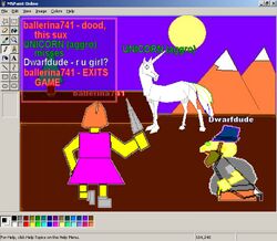
MSPaint: Online
- Multiple targets here: MSPaint and its maker, MMORPGs (which I don't get at all. Am I alone in this?), and dorks that hit on girls in online games. I would have made it more complex, but it needed the, how you say, "crap" quality that only MSPaint can provide. I like it, but if you could see how I'm dressed you'd know that I have terrible taste (think "Blind Eye for the Straight Guy")... Modusoperandi 00:50, 15 July 2006 (UTC)
- I added the correct "edge" around the pic (MSPaint's header/toolbox, etc. Now it looks right. F5 to update if you don't see the wraparound. Modusoperandi 06:57, 16 July 2006 (UTC)
- I kinda just skipped MSPaint and went straight for Corel, so I'm lost there. I've never embarked on one of those massively monotonous RPGs, but I've heard about them on the streets. So I'm afraid I can offer no help on this image. It's got a Grue, which doesn't seem to be openly embraced right about now. Maybe nix the Grue and put in a unicorn. With cotton candy. See?.. I told you I'd be no help. -- Imrealized 01:30, 17 July 2006 (UTC)
- I put the Grue in, because I'm not bored of Grues, and because Msoft never gets it right the first time around. Originally I'd even spelled it "Groo", but I figured that I'd get flack fer me badd speling. Unicorn, you say? Hmmm.... Modusoperandi 03:26, 17 July 2006 (UTC)
- The grue has been replaced with a unicorn, thanks Imrealized for the suggestion. No room for the cotton candy, though. Also, I must be getting used to MSPaint because the unicorn actally looks like a unicorn...If anything it looks too good. I'm freaking out. Modusoperandi 04:22, 17 July 2006 (UTC)
- I gotta admit, I still don't fully understand this picture (sorry) but I think the unicorn actually looks much better than the Grue. And to think I was only kidding when I said it. Nice work. -- Imrealized 23:36, 17 July 2006 (UTC)
- Thanks, I'm still disturbed that something drawn in MSPaint actually looks like what it is. Also, I'm still freaking out. Modusoperandi 00:41, 18 July 2006 (UTC)
WILL YOU STOP TRYING TO GET ALL YOUR IMAGES FEATURED!? Other than that, this image is kind of funny...I'd vote for. -- SonicChao Babbel!Contribs 00:17, 18 July 2006 (UTC)
- Wow, the ones that I don't put on VFP, he likes. Someone write that down. It might prove to be a critical piece of information later in the film. Modusoperandi 00:41, 18 July 2006 (UTC)
- ...and no, I'm not going to be nomming anything ever again, self or otherwise. My one nom on VFH is stuck at 22, and VFP has been a disaster of unmitigated proportions (except "left behind", that was actually worth it). If there's one thing that I've learned in the past couple of weeks it is that I'm too close to my own forest to see the proverbial trees. It's been humbling, I highly recommend it to anyone who has a head that is disproportionate to their body. Also, I've learned that MSPaint makes good unicorns, for some reason. Modusoperandi 01:05, 18 July 2006 (UTC)
- Sorry...due to the flood of pictures from you, that was the first thing that popped into my head. If they are that good let someone else nominate them, ok? (PS. If this doesn't appear on VFD in a few hours, I'll nominate it) --
 SonicChao Babbel!Contribs 11:47, 18 July 2006 (UTC)
- Cool, got it. Moving on...must...go...outside...must...get...sun! Modusoperandi 14:04, 18 July 2006 (UTC)
- This rules. Marshal Uncyclopedian! Talk to me!
- Thanks. It's tough to dislike a pic that both zings Microsoft and has a unicorn. With a guy hitting on a girl while online it's a triple threat (less the singing, dancing and acting). Modusoperandi 03:42, 21 July 2006 (UTC)
- This is now being voted on at VFP. Marshal Uncyclopedian! Talk to me!
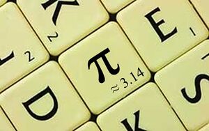
Scrabble Pie
For use with my HowTo:Cheat At Scrabble article. --—Braydie 12:33, 2 December 2006 (UTC)
- Shouldn't there be an "approximately equal to" sign before the "3.14"? You know, the squiggly equal sign.--Sir Modusoperandi Boinc! 12:51, 2 December 2006 (UTC)
- Indeed --—Braydie 13:03, 2 December 2006 (UTC) Update: What about now? --—Braydie 13:11, 2 December 2006 (UTC)
- Mmmmm... pie. Me likey. -- Hindleyite Converse 13:13, 2 December 2006 (UTC)
- That's it. Oh, squiggly equal sign...how rarely you show up outside of school.--Sir Modusoperandi Boinc! 13:17, 2 December 2006 (UTC)
- Well done image, no doubt about that, but its not making me laugh :( --Sir Zombiebaron 17:05, 2 December 2006 (UTC)
- Comment: Yeah that's true, it's more
stupid clever if anything. --—Braydie 17:51, 2 December 2006 (UTC)
- Pi has always been the most divisive irrational number. --Sir Modusoperandi Boinc! 22:53, 2 December 2006 (UTC)
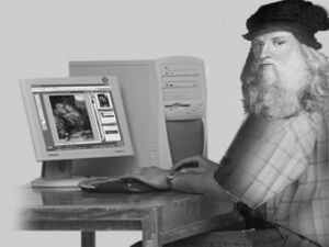
Infamous Da Vinci Portrait
Please please slap comment the image. Well, I don't have any other things to say :P. Thanks in advance. It's gneomI 12:25, 30 November 2006 (UTC)
- There are some problems with this image, and not all of them are correctable. First, the head looks awkward on the shoulders, the angle is wonky, but that's mainly because his head is turned all the way around, I'm not sure how you'll fix that. Then there's the fact that we've already got at least one featured picture with Mona Lisa in it. That should be correctable by picking a different Da Vinci picture to use (or maybe changing it to Michaeangelo working on the sistine chapel, or Da Vinci working on one of his futuristic designs). That's what strikes me first off.--<<
 >> 12:47, 30 November 2006 (UTC)
- Thank you very much! Be right back with a new image :P. It's gneomI 12:56, 30 November 2006 (UTC)
- Try that one. I think the head angle is suitable, if you take a look at this image. I have also changed the artwork. Cheers -- It's gneomI 13:07, 30 November 2006 (UTC)
- Damn beards! Sorry, I got away from my self there. Turn your head to the left (no, seriously. Do it. This will make sense, eventually). See how much room is 'tween your chin and shoulder? Not much, right? Now see how far it is from the tip of your chin to the "edge" of your shoulder. A bunch, right? Now imagine having a beard. If you have a beard and look left, it gets all bunched up in front of your chest. Some may flow over your shoulder, but not all. So, in combination with his big hair (back to this picture), there'd be the beard on the left, a gap with his shoulder, a big of back, and hair on the right.
- ...and the big shadow on the front of his sleeve is too thick (you added it to match the shadow on Leo, I'm guessing). Play around with it. Walk away from it for a few minutes. Then come back and see if it "fits". If not, tweak and repeat. Do not do this as a drinking game, you will get very drunk.--Sir Modusoperandi Boinc! 16:00, 30 November 2006 (UTC)
Hey thanks so much. Seems so hard, but what the hell, I'll try, hehe. THanks again - It's gneomI 00:02, 1 December 2006 (UTC)
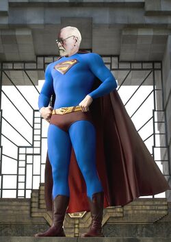
Superego
| Please Help this Picture
|
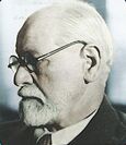
Sigmund Freud in the guise of his secret identity / alter-ego, Superego. Unfortunately, his debilitating emotional hangups about changing in public phone booths often prevented him from expressing this part of his character. Image credit: Todd_Lyons
Nominate - discuss this image
|
|
Any advice on making this not suck? ~ Sir Todd GUN WotM MI UotM NotM MDA VFH AotM Bur. AlBur. CM NS PC (talk) 03:08, 29 November 2006 (UTC)
- Freud's head is out of perspective w/his body (his head, in relation to the body, is leaning forward and right). Try to find either a Superman pic w/the same perspective as Freud, or vice versa. Alternatively you can "lean" the front of the head up, or "narrow" the top a bit (or a combination of the two). Both "lean" and "narrow" might work, but it's a fudge.
- The shadows are on opposite sides too. Use a "darken" mask over Freud's head, where the shadows on the right would be.--Sir Modusoperandi Boinc! 03:29, 29 November 2006 (UTC)
- I can try leaning the head, but the body orientation of the Freud and the Superman were the same (which is why I selected them). If it still looks askew, I could try to find another Superman body. Colour pix of Freud aren't as common. Thanks. :) ~ Sir Todd GUN WotM MI UotM NotM MDA VFH AotM Bur. AlBur. CM NS PC (talk) 03:42, 29 November 2006 (UTC)
- It's been a long day...it looks to me like Superman's shoulders rise from left to right, but Freud's eyes are level (which means if the "camera" was raised he'd have his head cocked to one side). Although his eyes could really be level in the "real", you'd see the underside of his chin (as the Superman pic is bottom up while Freud is level).--Sir Modusoperandi Boinc! 03:46, 29 November 2006 (UTC)
- The mixed shadow sticks out more to my eye anyway. Besides overlays/masks are fun. Just ask the children at the birthday parties I attend, where I go ask "Photoshop the Clown". Sometimes I break up the monotony of fun by teaching them long division.--Sir Modusoperandi Boinc! 03:49, 29 November 2006 (UTC)
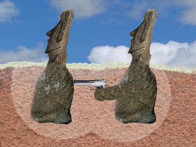
Hidden Thing About Moai
"Sorry" to add many images here. Lately I just like to create pointless images. Thanks - It's gneomI 13:45, 25 November 2006 (UTC)
- Hehe.--<<
 >> 15:33, 25 November 2006 (UTC)
- Hehe what? Hehe -- It's gneomI 07:27, 26 November 2006 (UTC)
Alternative Colour Blind Test
| Please Help this Picture
|
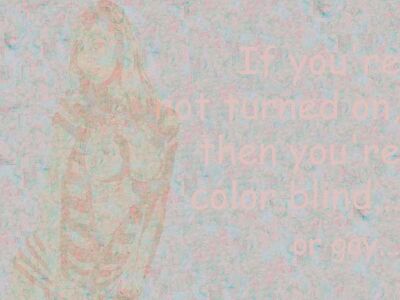
The newest test from The University of Naked People. It can also heal colour blindness. Image credit: Gneomi
Nominate - discuss this image
|
|
- Like, 100% blank? Thanks for the review. It's gneomI 09:18, 24 November 2006 (UTC)
- This is odd; normally I'm invisible to girls...--Sir Modusoperandi Boinc! 09:23, 24 November 2006 (UTC)
- Oh, yeah, I tried to minimise the colour, and you might want to see Color blind. Is it that bad?? It's gneomI 09:27, 24 November 2006 (UTC)
- I was trying to play along...--Sir Modusoperandi Boinc! 09:56, 24 November 2006 (UTC)
Oh, hehehe, so it is not that bad? It's gneomI 10:28, 24 November 2006 (UTC)
- Yup, it works.--Sir Modusoperandi Boinc! 10:32, 24 November 2006 (UTC)
- Possible VFP worthiness? :P If not how can I improve it? Cheers - It's gneomI 10:36, 24 November 2006 (UTC)
- I'll let someone else answer that question (my VFP-sense is weak, at best) --Sir Modusoperandi Boinc! 10:45, 24 November 2006 (UTC)
- Oh, alright, thanks for the review, again. -- It's gneomI 10:49, 24 November 2006 (UTC)
- So does the fact that I have to squint to read the text mean I'm color blind?---
 Rev. Isra (talk) 16:07, 24 November 2006 (UTC)
- Well hmm, that could be true, but most likely not, because you can see it. It's just, most colour blind tests are hard to read. I have tried to make it clearer but then it became too obvious. Any suggestion? It's gneomI 22:04, 24 November 2006 (UTC)
- I'd
hit vote for this.--<< >> 01:00, 25 November 2006 (UTC)
The Cold War Battle
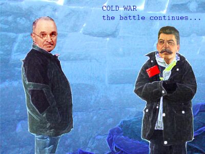
- My advice is, unless you are going for a cartoon/cutout appearance, trim off the white fringe on the figures. Alksub 21:45, 21 November 2006 (UTC)
-
- Well, what do you think? Should I go with cartoon or real appearance? I'm still thinking about the best typeface. It's gneomI 06:56, 22 November 2006 (UTC)
- A cartoon ice type would be good.
 18:15, 23 November 2006 (UTC)
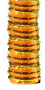
Really Big Mac
- The places where the Big Macs were joined are too obvious. You should clone some of the bun over the left edge of the join and smooth. Alksub 21:42, 21 November 2006 (UTC)
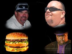
Biggies
- Oh, the joys of matching photos from different sources...try lowering the brightness/contrast a bit on the top right and bottom left pic. You may want to pull the bottom right pic closer to centre, for balance. It looks like he's trying to escape from the pic at the moment.--Sir Modusoperandi Boinc! 20:11, 19 November 2006 (UTC)
- Well, yeah, its just bunch of pics added together. But I wanted to point out the Big things, hehe. Thanks for the comment. It's gneomI 10:26, 21 November 2006 (UTC)
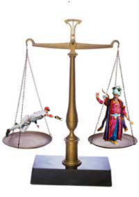
Weighing Pros and Khans
- I came up with this really really bad pun on the bus and decided that I had to make it. --Sir Zombiebaron 17:27, 14 November 2006 (UTC)
-
- Agreed, sort of. If you can find a more "instantly recognizable pic of a Khan", use it instead. Failing that, go with the Startreky guy.--Sir Modusoperandi Boinc! 22:03, 15 November 2006 (UTC)
- How about...you guys link me to an image? Cause I spent like an hour finding the current khan picture. --Sir Zombiebaron 23:17, 15 November 2006 (UTC)
Could it be weighing a book (prose) vs. a statuette of Khan Noonien Singh? I think that could be funny.--<< >> 02:56, 16 November 2006 (UTC)
- Yes! Thank you so much Brad! I asked all my friends, and noone could come up with a word that sounded like "pros" but ment something diffrent! Could you provide me with a picture of the statuette? --Sir Zombiebaron 02:58, 16 November 2006 (UTC)
- Dunno about a statuette, but there's this. Autographed 'n everything! I'd hunt harder, but I can feel my nerd gene starting to kick in.--Sir Modusoperandi Boinc! 03:22, 16 November 2006 (UTC)
- Heh. Acctually Modus, it needs to be of the full body. That was the problem I had, not finding images of other body parts ;) --Sir Zombiebaron 03:28, 16 November 2006 (UTC)
- Head+torso swap? You just need to tint the existing Khan's clothes brownish to match Ricardo-Kahn's real Corinthian leather. Alternatively, make Ricardo-Khan a bust.--Sir Modusoperandi Boinc! 03:40, 16 November 2006 (UTC)
- Sorry I haven't responded. I've been out of town. I, too, favor the idea of a Khan bust (necessity being the mutha of invention, and all that).--<<
 >> 23:24, 19 November 2006 (UTC)
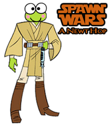
Obiwan Keroppi
- I came up with the idea of this on Halloween, and have been fidling around with this picture since then. Now I release it here for everyone's suggestions and complaints. --Sir Zombiebaron 15:59, 14 November 2006 (UTC)
- I like this. The only thing that sticks out is the line thickness difference between head and body. ~ T. (talk) 16:26, 14 November 2006 (UTC)
- Ugh! I just spent the last 2 hours trying to fix the line thickness! Maybe if we don't tell anybody, no one will notice it... --Sir Zombiebaron 16:30, 17 November 2006 (UTC)
- I like it, good to see people doing something a little different. -- Sir Mhaille
 (talk to me)
- Might be worth making it a little wider and making a Star Wars logo specifically for it? -- Sir Mhaille
 (talk to me)
- Okay, I think I'm done with this. --Sir Zombiebaron 22:29, 24 November 2006 (UTC)
- Well if it represents a frog, then where is the tail ? -- di Mario 22:37, 24 November 2006 (UTC)
- You failed biology class, right?--Sir Modusoperandi Boinc! 23:10, 24 November 2006 (UTC)
- You obviously never have lived in Dutchland. Over here, every hep frog has at least one fine piece of tail on a regular basis. Lucky frogs get two or even three at the same time ! But seriously, yes I know abouth tadpools and frogs and how one spawns the other (though I never worked out the "birds and bees" reference) and yes, I like the image too. -- di Mario 10:41, 26 November 2006 (UTC)
- Di, full grown frogs do not have tails, as Modus pointed out. You are thinking of "tadpols". Once again, a new version. --Sir Zombiebaron 23:20, 24 November 2006 (UTC)
- spawn wars, a newt hop...<giggle>. You do know that puns are the lowest form of humour, right?--Sir Modusoperandi Boinc! 23:30, 24 November 2006 (UTC)
- And that's why it's a such a beautiful thing that we're all here, at Uncyclopedia, the Publisher's Clearinghouse of the lowest forms of humour. :) ~ Major Sir Todd Lyons GUN WotM MI UotM NotM MDA VFH AotM Bur. AlBur. CM NS PC 23:50, 24 November 2006 (UTC)
- I like this, by the by.--<<
 >> 01:02, 25 November 2006 (UTC)
| Please Help this Picture
|
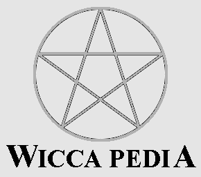
This is an image I made for a hypothetical website, Wiccapedia, which will provide its viewers with information on how to become a Wiccan. It’s a bit crude right now (since I used MS Paint). If anyone wants to improve it then your help would be greatly appreciated. Image credit: Weri long wang
Nominate - discuss this image
|
|
Weri long wang 13:26, 12 November 2006 (UTC)
- Not related to the image, but its been done here and here and elsewhere. You can even get yourself an eGrimoire! -- Sir Mhaille
 (talk to me)
- I don't actually intend to build a website myself. I just hoped to add it as a funny image to the Wicca article. The problem is that my version is so crap it could do with being cleaned up.Weri long wang
Another image of the goddess you don’t pray to
| Please Help this Picture
|
Here’s another image I created using the newly downloaded gothic font coupled with the snow text effect. How about this one? Image credit: Weri long wang
Nominate - discuss this image
|
|
Weri long wang 23:14, 9 November 2006 (UTC)
- See my previous comment. --~

Jacques Pirat, Esq. Converse : Benefactions : U.w.p.
23:12, 10 November 2006 (UTC)
Athe full
- Is it any good? Appreciate comments on it. Weri long wang 20:00, 9 November 2006 (UTC)
- It's pretty. I'm not sure about that typeface though...when I think gods (even atheist ones), I picture something more Gothic.--Sir Modusoperandi Boinc! 20:19, 9 November 2006 (UTC)
- Gothic? OK, I'll try to find something more gothic. Weri long wang 20:40, 9 November 2006 (UTC)
- Here’s the new version with 3D gothic text. How’s this? Weri long wang 21:06, 9 November 2006 (UTC)
- I thoght these things needed humor?--The Jeff Killer 20:26, 10 November 2006 (UTC)
- Well jokes that make fun of religion are funny to people who don't have an "I'm an American" userbox plastered on their userpage. Weri long wang 21:00, 10 November 2006 (UTC)
- I just plain don't find it funny. It just looks like you plastered "What are you praying at" to some GIS image and added thunder to it(although many images are made in a similar fashion the concept is not absurd or illogical or anything that would make it humorous other than the goddess being against many religious values for many religions, which would not ring in as funny as something like the Michaelangelo painting in the Sistine chapel modified to showing God giving the finger to man). --~

Jacques Pirat, Esq. Converse : Benefactions : U.w.p.
23:12, 10 November 2006 (UTC)
- You need to read the Atheist article to understand the joke. The joke is that Atheists are not disbelievers in a supernatural deity; they just don’t mention or pray to their goddess (Athe) because they believe she doesn’t like it. Here Athe is displayed her dislike of people praying to her.
- p.s. that is indeed how I created the image. How else would I have created it?Weri long wang 00:14, 11 November 2006 (UTC)
- I suppose the aforementioned image concept sounds funny. Maybe I’ll have a go at doing that instead. At least more people will understand it!Weri long wang 01:02, 11 November 2006 (UTC)
- Fuck you, asian dude. I like my country. Just 'cause we're not all homogenous.--The Jeff Killer 04:56, 12 November 2006 (UTC)
- !???--Sir Modusoperandi Boinc! 05:09, 12 November 2006 (UTC)
- Homogenous. Remember? From science class? Homogenous - A group of something that is similar. As in China (or wherever he's from) is populously homgenous. Get it?--The Jeff Killer 04:27, 14 November 2006 (UTC)
- Also, I don't like this picture because of the (really!) scantily clad female.--The Jeff Killer 04:29, 14 November 2006 (UTC)
- T'was more the first bit...that and the "your comment is not making sense" thingy. Which you weren't.--Sir Modusoperandi Boinc! 05:24, 14 November 2006 (UTC)
- Is Jeff Killer intollerant of foreigners as well as people named Jeff? Does he also kill them? Perhaps Biggus Dickus should be warned, in case he also hates Romans. ---
 Rev. Isra (talk) 15:22, 14 November 2006 (UTC)
Vandalism at it's Finest
Stephen Douglas Attack Ad
| Please Help this Picture
|
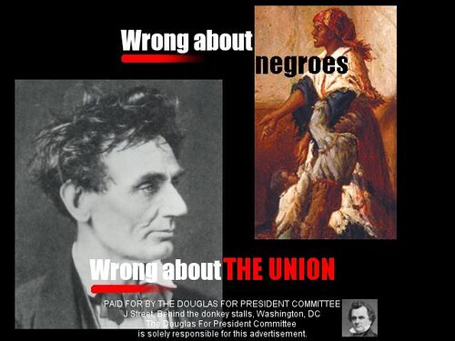
As he fell behind in the 1860 presidential campaign, Stephen Douglas launched a blitz of negative television advertisements. This one, like the others, was titled "Black People." Image credit: Procopius
Nominate - discuss this image
|
|
- I was thinking of doing something showing negative television advertisements throughout history. Not really looking to get it VFP (although if you think it reaches that level, great) but I'm looking for suggestions as to how to make this look like an attack ad. And to see if this is as funny to others as it is to me.--Procopius 01:46, 2 November 2006 (UTC)
- If it's era specific you can play the white race card - tho' it may be tough to pull off w/o appearing to be kkk ("darkies", although distasteful, could work). Or if you want, go the opposite way; PC would work too ("chattel americans", "indentured americans" etc). Or, you could ignore me entirely, and go with "black people". That's what I'd do.--Sir Modusoperandi Boinc! 19:17, 2 November 2006 (UTC)
- Thank ye kindly. I actually thought about that, but I stopped because of my own discomfort with the word (although, as you say, Douglas would not have had similar compunctions). Does it look like a still from a TV ad?--Procopius 04:03, 3 November 2006 (UTC)
- Yes, it's spot on, although it's too bad that Lincoln was from an era where all photos were stages (it'd be better w/one of the "bad frames" of film, where he's halfway through a blink or has an evil expression on his face, like modern attack ads use)...and I too felt dirty when I used a slur on one of my pages, but it was appropriate, so I left it (and put it back when someone changed it). It's tough to use "those words", even in satire, as unless they're done well it just looks racist (White guilt...check). It's your page, so do what you think works best.--Sir Modusoperandi Boinc! 04:24, 3 November 2006 (UTC)
- You know, there is a photo of Lincoln out there with really messed-up hair (which he said was truer to life than his regular photos). Wonder if I can find that.--Procopius 17:07, 3 November 2006 (UTC)
- Not to mention that unfortunate "Emancipators Gone Wild" video...--Sir Modusoperandi Boinc! 19:51, 3 November 2006 (UTC)
Might I suggest the word "negroes" as a middle ground in between what we all know he would have said (hint: it's that word that keeps Huck Finn out of many school libraries), and what is "appropriate." I personally think that picture is a whole lot more offensive than anything you could put with it, so you could go for the Gold, as they say, but I think we both know that'd likely to hurt your chances at a feature more than helping.--<< >> 20:19, 3 November 2006 (UTC)
- I think he's going with either as is, or with a bad pic of Lincoln. Which is probably for the best. --Sir Modusoperandi Boinc! 20:28, 3 November 2006 (UTC)
- Well, it's important to note that Douglas would not admitted that blacks were "people," so it may be worth looking into changing that word to be somewhat more ... "wrong" ... for the sake of accuracy. Again, do whatever.--<<
 >> 20:32, 3 November 2006 (UTC)
- "Negroes" it is. As for the picture, I agree it's offensive. I wonder if there's a similar compromise out there. Because it doesn't need to be offensive; it just needs to do what Douglas did then, and what an ad in Tennessee does today.--Procopius 20:38, 3 November 2006 (UTC)
- You just answered your own ponder, "it just needs to do what Douglas did then, and what an ad in Tennessee does today." So, a modern sheen on and old gem, as it were. Which is what you've got now, potentially making this entire thread moot. Moot!--Sir Modusoperandi Boinc! 20:46, 3 November 2006 (UTC)
- OK, it's updated. How's that?--Procopius 01:55, 4 November 2006 (UTC)
- I like the new Abe and the text, but prefer the old black person pic. It's what Douglas would do. I say this, of course, knowing very little about Stephen.--Sir Modusoperandi Boinc! 02:20, 4 November 2006 (UTC)
- Much better pic... I'm wondering if Modus might be right and the other pic might be better (by being worse... if you catch my meaning).--<<
 >> 05:32, 4 November 2006 (UTC)
- Is the original black person picture too offensive, though? Douglas was an unapologetic racist, but even he knew his limits. As Abe said, "No man will ever be elected president who spells "negro" with two g's." (Or something like that).--Procopius 13:51, 4 November 2006 (UTC)
- Actually, it was William Seward. Carry on . . .--Procopius 17:24, 4 November 2006 (UTC)
Maybe you could put a 1 pixel black border around "wrong on" so it doesn't blend into the oh-so-white color of Lincoln's skin. --- Rev. Isra (talk) 16:27, 4 November 2006 (UTC)
- Good idea. Thanks.--Procopius 17:24, 4 November 2006 (UTC)
- OK, last update. I think I found a good compromise on the right side of the image. Sadly, I couldn't do a border without making it look like a five-year-old do it. Anyway, thanks for all your input.--Procopius 01:09, 5 November 2006 (UTC)
- Looks good. (/me considers nomming it for VFP, but is afraid of the voters...)--<<
 >> 03:52, 5 November 2006 (UTC)
- It occured to me that this is among the best images I've ever made. I'll probably nom it to VFP, but first, I must ask if there is anything wrong/lacking in quality. Also, needs a caption. -- §. | WotM | PLS | T | C | A 00:14, 31 October 2006 (UTC)
- LOL! Go for it, that's great.--<<
 >> 00:24, 31 October 2006 (UTC)
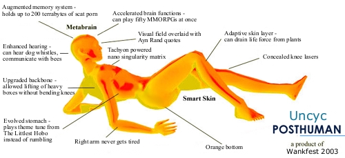
Uncyc Posthuman
- I'm assuming that it makes sense in context of its article...it's not bad considering the arcane subject matter. Of course, I don't keep up on this newfangled technology like you kids do these days.--Sir Modusoperandi Boinc! 19:09, 28 October 2006 (UTC)
- The joke is text based, and the picture is nothing. --Sir Zombiebaron 02:48, 8 November 2006 (UTC)
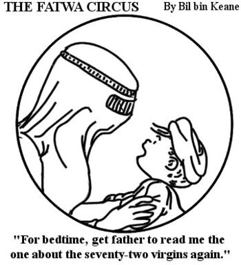
The Fatwa Circus
- Just trying something different. I can't decide if it's funny or not...--Sir Modusoperandi Boinc! 05:01, 27 October 2006 (UTC)
- I like this one. Would be cool if the father was showing the kid a bomb.


 19:16, 28 October 2006 (UTC)
- I tried to keep as close to the original comic as possible. Adding a bomb is unnecessary IMO, simpler is better in this case; as it leaves it up to the viewer to fill in the blanks. I'm experimenting with subtle (from the bludgeon of American Fundie Magazine, to the pointy stick of Solid Gold, to this). At this rate, by 2010, my stuff will be so subtle you won't even know who's being zinged.--Sir Modusoperandi Boinc! 19:33, 28 October 2006 (UTC)
- And then you can start writing about bukkake zombies - David Gerard 01:38, 4 November 2006 (UTC)
- When they're a political force that threatens the safety and brains of mankind, perhaps.--Sir Modusoperandi Boinc! 01:44, 4 November 2006 (UTC)
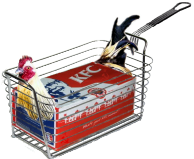
- My 3rd attempt at making Chickenbox look better. Not as 2D was the original image.


 18:47, 28 October 2006 (UTC)
- My opinion.....THIS is the one. The original gag was a good one, only the quality was an issue. This version is very well made, would get my vote on VFP. Nice work. -- Sir Mhaille
 (talk to me)
- Unfortunately, it's obvious that you didn't choose a good chicken photo for the photoshopping, otherwise it would be all perfect. Well, I suppose nothing is perfect in the real world. Hee... Anyway, nice work, Tom! -- The Colonel (talk) 19:20, 28 October 2006 (UTC)
- There are "jaggies" between the box and the bars, and the lasso, while handy, is dangerous if it blurs edges too much (as with the tail). The devil is in the details. --Sir Modusoperandi Boinc! 19:41, 28 October 2006 (UTC)
- Much better than the original. I'd vote for this.--<<
 >> 19:56, 28 October 2006 (UTC)
- Great! I'm off to KFC right now to get one... -- Hindleyite 20:12, 28 October 2006 (UTC)
- I just noticed the Hammer/Sickle on the box. I see the Chickenbox page has Lenin in one of the pics and a link to Communism, but I'm not understanding the commie connection...--Sir Modusoperandi Boinc! 20:40, 28 October 2006 (UTC)
- It's just my own thing.


 20:47, 28 October 2006 (UTC)
- Your own thing is shaped like a Hammer/Sickle? Ewww.--Sir Modusoperandi Boinc! 21:17, 28 October 2006 (UTC)
- Okay, I smooth the basket wire. Does it help?


 23:24, 28 October 2006 (UTC)
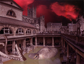
Cthulhu Rises
- Trying an experiment at altering en.wp's featured pictures. This one probably needs more work, but I've hit a wall, so comments are appreciated. ---
 Rev. Isra (talk) 01:42, 25 October 2006 (UTC)
Umm...where's the image? --Sir Zombiebaron 01:45, 25 October 2006 (UTC) Nevermind. --Sir Zombiebaron 01:49, 25 October 2006 (UTC)
Could use some subtle rippling (I hate manipulating water, it's so finicky) and shadowing. Maybe wrap a tentacle around a column for added verisimilitude. Also, just a personal thing, but I've never found Cthulhu jokes funny. —rc (t) 01:50, 25 October 2006 (UTC)
I'm no Cthulhu expert, but isn't he greener/squishier than an octopus? In my nightmares, he looks like this. Spooky.--Sir Modusoperandi Boinc! 19:15, 28 October 2006 (UTC)
- Octopus are good at changing colors though.


 19:18, 28 October 2006 (UTC)
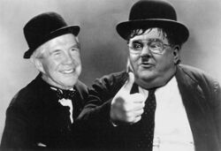
Laurel and Hardy Redux
- Too obscure?--Sir Modusoperandi Boinc! 05:13, 23 October 2006 (UTC)
- Or, if you prefer long captions, "Pat Robertson and Jerry Falwell have united to take Hollywood back from the Jews in a remake of Laurel & Hardy's 'Another Fine Mess'. (Directed by Steven Spielberg, a Joel Silver production)"
- Too obscure for me. Also, Falwell/Hardy's mouth doesn't look right. And I can't tell his finger is on fire in the small one. ---
 Rev. Isra (talk) 06:13, 23 October 2006 (UTC)
- I'm still tinkering...sadly some 'chops are limited by the originals. Not surprisingly anti-education technophobes like Falwell & Robertson don't have a big internet presence. Well, that's not true; they have sites. Sites that say how bad the interweb is. I'll make the flame bigger, and swap Oliver's mouth back for Jerry's.--Sir Modusoperandi Boinc! 06:32, 23 October 2006 (UTC)
- V1.4 - big flame, swapped mouth & eyes. Me go bed now.--Sir Modusoperandi Boinc! 07:55, 23 October 2006 (UTC)
- I like the idea.


 19:11, 28 October 2006 (UTC)
- So do I. The paradox of their ignorance/bile versus the naivety/slapstick of Laurel&Hardy cracks me up.--Sir Modusoperandi Boinc! 19:20, 28 October 2006 (UTC)
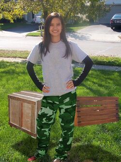
Cargo Pants Anybody?
I'm worried that the shadows are teh sucksaws, and this image is neither topical nor timeless. Looks kinda like the boxes are levitating. Alksub 17:44, 21 October 2006 (UTC)
- The boxes do not look sufficiently attached to the pants. When I first looked, I just thought that there were boxes in the background. ---
 Rev. Isra (talk) 19:21, 21 October 2006 (UTC)
- I would second that. What might work better would be if the cargo was actually on the pants, or the pants actually were completely made of cargo. You know, like a wooden version of plus fours. See if you can get a picture of someone in baggier pants and add the texture. -- Hindleyite 17:52, 22 October 2006 (UTC)
Course Adjustment Knob
-
- Sorry, I misspoke, it's a good pic, on its page (standalone, not so much). So many pics come through enroute to VFP that I had just assumed... The only oopsie I see is, while the gadget body lean, the "grip" part of the knob leans left. If you mirror the body, it'll be closer (I don't know how many people will notice, anyway). --Sir Modusoperandi Boinc! 18:03, 19 October 2006 (UTC)
- <English teacher> Shouldn't the text at the bottom read 'It makes everything as easy as turning a fucking knob'? </English teacher>-- Hindleyite 18:09, 19 October 2006 (UTC)
- Fixed...and then revamped... --~

Jacques Pirat, Esq. Converse : Benefactions : U.w.p.
18:44, 19 October 2006 (UTC)
- HA! I like it a lot.--Procopius 18:47, 19 October 2006 (UTC)
- I think it works well within the article... as such, job done? -- Hindleyite 17:53, 22 October 2006 (UTC)
 SonicChao Babbel!Contribs 00:17, 18 July 2006 (UTC)
 SonicChao Babbel!Contribs 11:47, 18 July 2006 (UTC)
 >> 12:47, 30 November 2006 (UTC)
 Rev. Isra (talk) 16:07, 24 November 2006 (UTC)
 22:43, 21 November 2006 (UTC)
![]() >> 02:56, 16 November 2006 (UTC)
>> 02:56, 16 November 2006 (UTC)
 (talk to me)
 (talk to me)
 >> 01:02, 25 November 2006 (UTC)
 (talk to me)
 23:12, 10 November 2006 (UTC)
 00:52, 9 November 2006 (UTC)
![]() >> 20:19, 3 November 2006 (UTC)
>> 20:19, 3 November 2006 (UTC)
 >> 20:32, 3 November 2006 (UTC)
 >> 05:32, 4 November 2006 (UTC)
![]() Rev. Isra (talk) 16:27, 4 November 2006 (UTC)
Rev. Isra (talk) 16:27, 4 November 2006 (UTC)
 (talk to me)
 Rev. Isra (talk) 01:42, 25 October 2006 (UTC)
 Rev. Isra (talk) 06:13, 23 October 2006 (UTC)
 Rev. Isra (talk) 19:21, 21 October 2006 (UTC)


