Uncyclopedia:Logos
Add your own logos for namespace consideration. Images should be 152 pixels wide by 132 pixels high, with the logo centered in the image. Potatoes are for the moment not a required element but they are highly recommended.
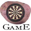
Game
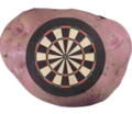
Zombiebaron Target Potato #1
Zombiebaron Target Potato #2
Zombiebaron Target Potato #2 (resized to correct size, and text changed by Splaka per Rcmurphy's suggestions)
Kaizer the Bjorn SNES Potato
Currently implamented on Game:
Namespace
Zombiebaron (I can change the font/font size on command, I wasn't sure witch font to use, so I just went with the same one I used in my campaign posters.)
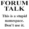
Forum
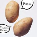
Zombiebaron(Proposed, although someone may need to make it more logolike)
MoneySign (Bah!! Me no likey...)
MoneySign (Cheap attempt, really... Implemented for Forum:)
Zombiebaron (I like it, but I think google might hold copyrights on the two balloons)
- I don;t particularly like either of them. But then again, I have IE so i'll never have to ser them. Idk, I'm thinking maybe potato skin scrolls, or like two people using potatoes as phones... Something like that...

 t o m p k i n s blah. ﺞوﻦ וףה ՃՄ ண்ஸ ފއހ วอฏม +տ trade websites 19:31, 26 February 2006 (UTC)
 - I like the second one by $ very much.--Rataube 18:50, 5 March 2006 (UTC)
- I'd agree that the one that's being implemented right now is the best.

 t o m p k i n s blah. ﺞوﻦ וףה ՃՄ ண்ஸ ފއހ วอฏม +տ trade websites 18:53, 5 March 2006 (UTC)
- Implemented? Why can't I see it, I see the regular logo at the Forum pages :(--Rataube 18:58, 5 March 2006 (UTC)
- What browser do you use? I used to use IE and the only logo I could see on any page, but I switched to FireFox and now I can see all of them.

 t o m p k i n s blah. ﺞوﻦ וףה ՃՄ ண்ஸ ފއހ วอฏม +տ trade websites 18:59, 5 March 2006 (UTC)
- What browser do you use? I used to use IE and the only logo I could see on any page, but I switched to FireFox and now I can see all of them.
- Implemented? Why can't I see it, I see the regular logo at the Forum pages :(--Rataube 18:58, 5 March 2006 (UTC)
- I'd agree that the one that's being implemented right now is the best.
- Here's what Splarka told me to do:
- Go here
- Refresh
- Go to Forum:Village Dump.
- Worked a charm. --⇔ Sir Mon€¥$ignSTFU F@H|CM|+S 19:05, 5 March 2006 (UTC)
- Yeah... erm... how? ~ 17:30, 30 April 2006 (UTC)
- Erm... How what? --⇔ Sir Mon€¥$ignSTFU F@H|CM|+S 17:34, 30 April 2006 (UTC)
- Erm... Good point. Oh-oh, oh - what is what you said supposed to do? And how would you/one/someone do that? ~ 17:37, 30 April 2006 (UTC)
- It's supposed to work a charm. More specifically, make the different logos for the seperate namespaces appear correctly... But after trying this in Internet Explorer, I must say: it doesn't work... So, if you're using IE (like a good Microslave), I suggest you break free and head for the FireFoxian sanctuary... --⇔ Sir Mon€¥$ignSTFU F@H|CM|+S 17:47, 30 April 2006 (UTC)
- Ok... ~ 17:48, 30 April 2006 (UTC)
- IT WORKS IT WORKS IT WORKS ON IE NOW! ~ 11:15, 18 June 2006 (UTC)
- Yah, I simplified the css for namespace logos yesterday. Before it had an attribute selector (body[class="ns-##"]) but I changed it to just directly reference the body class (body.ns-##). --Splaka 04:49, 19 June 2006 (UTC)
- IT WORKS IT WORKS IT WORKS ON IE NOW! ~ 11:15, 18 June 2006 (UTC)
- Ok... ~ 17:48, 30 April 2006 (UTC)
- Erm... How what? --⇔ Sir Mon€¥$ignSTFU F@H|CM|+S 17:34, 30 April 2006 (UTC)
- Yeah... erm... how? ~ 17:30, 30 April 2006 (UTC)
UnMeta:
- Now used on the separate UnMeta wiki. - User:Guest/sig 12:17, 12 March 2006 (UTC)
- I like the pacman one.--Rataube 09:36, 13 March 2006 (UTC)
Image:
Rcmurphy (implemented on trial basis)
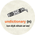
Undictionary:
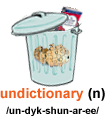
- I like Dustbin 3 best personally --Splaka 09:59, 22 January 2006 (UTC)
- I'm liking the circle behind the crayon, but also Dustbin3 --⇔ Sir Mon€¥$ignSTFU F@H|CM|+S 10:35, 22 January 2006 (UTC)
- I agree with splaka, the lighter dustbin is the best.

 t o m p k i n s blah. ﺞوﻦ וףה ՃՄ ண்ஸ ފއހ วอฏม +տ trade websites 00:44, 24 January 2006 (UTC)
 - i dont like any of them. The garbage isnt a good idea, lots of trash in undictionary, but the idea is that people write good short things, isn't it? If it isnt, it should be. Anyway, undictionary or not, dont encourage people to add trash! --Rataube 01:07, 24 January 2006 (UTC)
- Of our very limited choices, I also think Dustbin 3 is the best, but it's not very clean. If someone feels like sharpening it up, that would be peachy. I have a .psd for once (though it is the Dustbin 2 one) if anybody wants it. --—rc (t) 01:10, 24 January 2006 (UTC)
- I like "(Splarka told me to make one)" the best --Brigadier General Sir Zombiebaron 14:37, 5 March 2006 (UTC)
- I still like the dustbin, the one that Money made takes up too much room, maybe if you just shrunk it a little bit...

 t o m p k i n s blah. ﺞوﻦ וףה ՃՄ ண்ஸ ފއހ วอฏม +տ trade websites
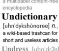
 - I prefer the text one, it looks more like the Wiktionary one, even though it doesn't show up on IE so it doesn't really count... ~ 09:06, 21 April 2006 (UTC)
QuoteUnquote:
SU - Unquotable
SU - QuoteUnquote Bomb
SU - QuoteUnquote Bear
Mhaille - QuoteUnquote - Spud
SU - Wikiquote/UnMeta pac-man logo hybrid
SU - NavTemplate top
SU - Deprecated
- I guess this is the place to put these... Assuming this namespace ever amounts to anything, I thought I'd throw these up here for consideration. If it doesn't, please delete. c • > • cunwapquc? 22:40, 27 February 2006 (UTC)
- Although the above logos fit in with the general scheme of similar namespace logos I'd like to see a version of the dark "Making Up Quotes" image that you (Some User} originally did for the section. -- Sir Mhaille
 (talk to me)
- See above. But is this for the top-left square? You don't think that would be too, I dunno, jarring? c • > • cunwapquc?
- I was thinking more like ... a speech bubble containing only a closing/end doublequote mark, where it looks like the speech bubble has been ripped apart and stuck back together with duct tape maybe ... or else whatever looks most like WikiQuote's logo ... but it doesn't seem very funny. --Nerd42Talk 17:17, 2 March 2006 (UTC)
Uncyclopedia:
Splarka (example, sucks)
Uncyclopedia talk:
Splarka (example, sucks)
- FOR!!! Just to piss Splarka off. <3 --KATIE!! 20:12, 22 January 2006 (UTC)
- For I love them, specially the talk one, the puzzle inside the puzzle suits perfectly!--Rataube 01:07, 24 January 2006 (UTC)
- For the talk version--Da, Y?YY?YYY?:-:CUN3 NotM BLK |_LG8+::: 02:39, 24 January 2006 (UTC)
- For both. --officer designate
 Lugiatm
  MUN NS CM ZM WH 18:05, 25 January 2006 (UTC)
UnNews:
MoneySign (currently on UnNews:)
Olipro (just an idea I threw out in the open)
Olipro (Moneysign's but in Blue)
*At the moment, I would opt for NewspaperD (but that could change to E) --⇔ Sir Mon€¥$ignSTFU F@H|CM|+S 10:35, 22 January 2006 (UTC)
- Forgot to change my vote, didn't I? Potato is now my favourite. And there's only 1 version, too! --⇔ Sir Mon€¥$ignSTFU F@H|CM|+S 18:58, 23 January 2006 (UTC)
- I wholeheartedly agree with ¥.
Except for changing to E. Cause that one sucks.(Well, it does still suck, but I still agree with ¥. KATIE!! 19:30, 23 January 2006 (UTC)) --KATIE!! 20:12, 22 January 2006 (UTC)
*Agree, D is the best. --—rc (t) 05:23, 23 January 2006 (UTC)
Uhm, I think I like "B", actually. "D" is too short. *(Runs away to avoid being smacked with a rolled-up "D")* --T. (talk) 12:07, 23 January 2006 (UTC)
- The potato globe is my new favourite. Good size, great colour scheme, continuity with the main logo... just well executed. Bravo. :) --T. (talk) 15:25, 23 January 2006 (UTC)
- MoneySign's potato for teh wihn! --officer designate
 Lugiatm
  MUN NS CM ZM WH 16:41, 23 January 2006 (UTC)
 - Same here.....I'm so proud to have been there at its birth.... -- Sir Mhaille
 (talk to me) 19:18, 23 January 2006 (UTC)
 - I was here too! Don't forget about me! I SAW IT FIRST!

 t o m p k i n s blah. ﺞوﻦ וףה ՃՄ ண்ஸ ފއހ วอฏม +տ trade websites 23:25, 23 January 2006 (UTC)
 - I vote fot the potato unnews logo. ---
 Rev. Isra (talk) 00:11, 24 January 2006 (UTC)
 - The potato world is great.--Rataube 01:07, 24 January 2006 (UTC)
- FORThe potato world would be better in my opinion with ignorance is strenght but i suppose that would break up the consistency in the logos--Da, Y?YY?YYY?:-:CUN3 NotM BLK |_LG8+::: 01:42, 24 January 2006 (UTC)
UnBooks
Uncyclopedian UnBooks should be a namespace.
For Unbookslogo.jpg Uncyclopedian 02:57, 13 July 2006 (UTC)
Uncycloversity
by Potatogurl24 is best logo!
Hope sb. is going to look here soon.. and I hope It'll be used :) --![]() Ráďa(talk), Necykloverzita's ambassador 18:55, 11 December 2008 (UTC)
Ráďa(talk), Necykloverzita's ambassador 18:55, 11 December 2008 (UTC)
Misc extra
Mostly to keep them from being deleted
