Uncyclopedia:Pee Review/Dreaming
Dreaming[edit]
Saw the que was empty, so I'll put in one or two. Thanks in advance! "Dreaming" may look like random in parts, but only because it's a dream. Much of the page is a play of going from one image to another, and one emotion to another, with hopefully some interesting stuff mixed in, in quick succession. Thanks again,
~ ![]()
![]()
- I'll get this one. I'll work on it a bit right now, but I can't promise it will be done today since I have various things the military requires of me today, mostly my time. Definitely by tomorrow night though. -- 09:39 4 Mar, 2010
- Thanks. I don't know why everyone thinks they have to do the review in one day or even two, I don't think that's a policy and may just have been a habit people fell into. Take as much time as you need on any of mine, a week, two. Take a vacation and come back to it. As long as you claim it, then that's all that's needed. What is the history of the hurry-up "policy"? And thanks again, I hope you enjoy the concept. ~

 16:57 4.3.2mx
- Thanks. I don't know why everyone thinks they have to do the review in one day or even two, I don't think that's a policy and may just have been a habit people fell into. Take as much time as you need on any of mine, a week, two. Take a vacation and come back to it. As long as you claim it, then that's all that's needed. What is the history of the hurry-up "policy"? And thanks again, I hope you enjoy the concept. ~
| Humour: | 6.5 | As you may or may not know, the way I review I generally put the majority of my comments and suggestions in the humor section. This allows me to Initial ImpressionsAt first I was a little weirded out by the sheer magnitude of the randomness, but I thought the lucid part was really funny. There are a couple of problems I noticed up front in terms of formatting, and generally I felt that the piece was a lot more random than funny, but there is an overall positive feel to the article. Besides the lucid part, there wasn't much that made me really laugh. There are ways to fix that of course. "In-depth" LookI feel like what you have here is more like a trip on drugs more than just a dream, if that makes any sense. It reads like a disjointed and trippy poem. Now, I only know about dreams from my own personal experience, but I would be inclined to think that this much variation doesn't happen in the average dream. dreams tend to progress, at least for me, along story lines. There's dialogue, there's a chain of events, not just a string of sensations. Now, these story lines tend to dissolve into other story lines, and I think this is where the feeling of random variation comes from. Because of the nature of your text, being a bunch of disjointed feelings and sensations, there isn't much in depth analysis I can do in terms of humor and how it progresses. Like I said earlier, there aren't too many 'funny' things here, but the ridiculousness of what is going on creates a sense of an overall funny atmosphere. I'll be sure to give you some more pointed advice under the concept section. |
| Concept: | 8.5 | I really think that the concept of having the article on dreams be an actual dream is a pretty neat idea, I just think your execution of this idea is a little off. Now, here's how I think you can turn this into a better article. Keep the randomness, but tone it down a bit. Add in elements of a story, events, dialogue, recurring characters. develop a story on a progression. A ridiculous story since this is a dream, with variation in story structure and stuff, but a progression none-the-less. This I think will work a lot better than simply having a bunch of random sensations that feel better suited to an acid trip, at least that's the kind of feeling this inspired in me.
I do like the idea you have of the dream starting out funky and then becoming lucid. I think it would be kinda cool if maybe you added elements of nightmare in there as well, maybe toward the end right before the person wakes up from the dream. As for the lucid part, I also like how you switch from bold text to regular in parenthesis, I knew exactly what you were trying to accomplish with that when I was reading. I also really liked how the words faded out and back into the regular dream. I would develop the lucid section maybe a just a little bit more. Have the person take control of their dream for just a little bit longer. I'm not to sure I like the running horse and the cowboy thing at the beginning though, I like it at the end of the article though where it links to the wikipedia bit about lucid dreams. I would get rid of that at the beginning. An idea I had about how the article can start is if the introduction starts off like a real article on dreams. perhaps even lifting the first part of the wikipedia entry on dreams would be a good idea. The "narrator" soon becomes bored with the academics of dreaming and starts to fall asleep in the middle of dictating the article, the article fades into his dream. just an idea. To convey falling asleep, perhaps the text could get tinier and... eventually, well..... ZZZZZZZZZzzzzzzz. Just an idea I had, maybe you'll like it, maybe not. at any rate, strong starting concept, but you need to go under the hood just a little bit to tone down the random. I think that could go a long way to making this more accessible and readable. |
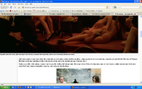
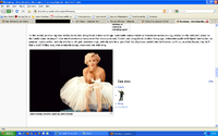
| Prose and formatting: | 6 | Now there are some issues with formatting here, and I'm not referring to the randomness of the article. I'll attach screen shots to illustrate my point.
As for the formatting a prose in general, I mean, it's fairly average. You seem to do an ok job of spelling and grammar (when applicable), but the way you've done the pictures in the middle and the general errors, the article feels sloppy, I would encourage a bit of cleanup. |
| Images: | 7.5 | I'll go through and give my impressions image by image.
On the whole, what you have in terms of images works for what you have already, but I feel that with revisions you should opt for pictures that tie into the text more closely. The images you have are fairly random, and so are the captions, and along with various formatting problems, I felt that you deserved a slightly above average score. |
| Miscellaneous: | 7 | my level of enjoyment from reading the article |
| Final Score: | 35.5 | If I could only tell you a few things to do in order to make this article better, it would be:
as always, if you have any questions about this review or anything at all, please don't hesitate to drop me a line. |
| Reviewer: | -- 15:31 EST 4 Mar, 2010 | |

