Pie chart
Pie charts are visual graphs meant to express quantities relative to each other. They are available in many flavors, and are especially popular during the holiday season. They are used far more frequently than their relatively new cousin, the Sphere Chart, and are widely considered to be the most informative variety of pastry available.
The pie chart is rarely used in scientific publications, as the warm, gooey insides tend to muck up the rest of the paper. It is one of the most widely criticized charts, and statisticians recommend avoiding its use altogether, and instead use bar charts or something similar. They point out that it is difficult to compare slices of a given pie chart to each other, especially the first slice which tends to be extremely messy. Pie charts tend to work best when slices represent 25% or 50% of the data, since these portions are most likely to be sliced evenly and those eating said slices are less likely to bicker about who got more.
History
The earliest known use of the pie chart was in Oscar Wilde's 1891 short story A House of Pomegranates, in which a rhubarb pie is divided amongst siblings to represent their share of an inheritance. They did not enjoy much success until the late 1920's, when the stock market crash necessitated the need for a new way of displaying how abysmally poor everyone was. Typical pie charts of this era handed out to the masses consisted of a solid colored circle, titled "How much money you had," and a single line, barely visible, on the circle, labeled "How much money you have now."
The pie chart fell into relative obscurity in the 1940s, along with anything that wasn't fighting World War II, talking about World War II, complaining about World War II, or the foxtrot. Their next resurgence came in the "Golden Era" of America: the 1950s. During this period young kids seeking to be "hip" would rebelliously use pie charts to express to their friends how many cigarettes they had smoked or shopkeepers they had hassled. They have enjoyed steady success since then, until recently, when the appearance of statisticians caused people's faith in pie charts to be thrown into doubt.
Varieties and Uses
There are many different 'flavors' of pie chart, each serving a different purpose. While nitpicking statisticians might tell you that none of these types is fit for official use or internal consumption, pie charts are in fact highly useful in expressing relationships among quantities (particularly warm or flaky quantities).
3-D Pie Chart
A 3-D, or "perspective", pie chart, can be used to impress potential clients who are unfamiliar with the drawing of three dimensional objects on two dimensional surfaces. It might also be useful to employ the technique of drawing two squares and connecting their respective corners, thus creating a "cube", and stunning these simple-minded folk. 3-D pie charts are rarely used because viewing them requires 3-D glasses, which are extremely expensive to manufacture.
Exploding Pie Chart
By far the most dangerous variety of pie chart, exploding pie charts may look harmless, but in fact contain a small amount of explosive material. Identifiable by their slices, which are separated, or 'exploded', from one another, they may range in explosive power from a cherry pie chart with a firecracker embedded inside to a pie chart cooked with nitroglycerine and dynamite chunks. Exploding pie charts are only recommended for use against one's enemies (particularly those enemies who are exceptionally vulnerable to explosions). Also included in this category are pie charts used in "pie-in-the-face gags", which usually do not serve any useful informational purpose, but do consistently generate high amounts of comedy.
Venn Diagram
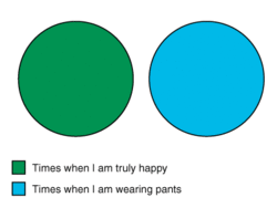
A distant cousin of the pie chart, the venn diagram, is used to express crossover between categories. An example would be the categories "Things that make baby Jesus cry" and "People who look like dinosaurs", represented by circles. Since Fred Phelps belongs to both categories, he would be located in the overlapping area of the two circles. Venn diagrams can range from a simple two-category comparison to a needlessly complex three-dimensional expression of the similarities of dozens of categories. More complicated expressions of overlapping classification have been rare since 1936, when the physicist, statistician and mystic Erwin Schrödinger, while describing his infamous "Schrödinger's cat" thought experiment, drew a seven-dimensional Venn diagram that became permanently lodged in his audience's dreams.
Controversy
Recently, pie charts have come under scrutiny from statisticians. These so-called academics, mostly comprised of dyslexics and alcoholics, claim that pie charts are a poor way of displaying information. One possible explanation is that all statisticians were born without taste buds, the ability to interpret shapes, or a soul. Despite pie chart proponents' repeated assurances that pie charts do not always burn the roof of your mouth and can be safely set on windowsills without being stolen, interfering statisticians insist on hijacking the integrity and gooey filling of pie charts in general.
While it is clear that statisticians may never be truly swayed in their irrational hatred, several prominent publications have endorsed pie charts. The Joy of Technical Writing claims that pie charts "are infused with the flavor of progress and the scent of fresh fruit." Many scientific journals have also neglected the input of statisticians, with Popular Mechanics & Edible Mechanics claiming, "the relevance of anything statisticians say is being increasingly called into question. For example, their theories on the Moon hoax, pie charts, and Bigfoot's role in building the Great Pyramids are all extremely suspect."
| Featured version: 24 February 2009 | |
| This article has been featured on the main page. — You can vote for or nominate your favourite articles at Uncyclopedia:VFH. | |


