Talk:Viking Metal
Jump to navigation
Jump to search
I will put aside my sword and rest now, satisfied for the moment, but ready to take it up another day and continue. Aleister 23:00 4-3-'11
- Wow, you are a tremendous nerd. 23:10, March 3, 2011 (UTC)
You know...[edit]
There is such a thing as too many images. Too big, for that matter. The two together doesn't make for the best combination.
~ ![]() 14:06, 28 March 2011
14:06, 28 March 2011
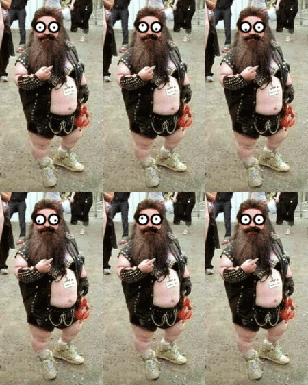
- Well, yeah, but it is a fashion show, so it's very visual. As for size, the biggest one, Tinber (Tinber!) looks rather cool that big, all with wings and smiles and club. I think you may have a shorter screen than the one I work on, because on mine the pics look fine and are formatted well, and others have larger screens than mine and I have no idea what it looks like. Your clomment is appreciated, and I did downsize the last Gwen the Green pic just now. Aleister 1:58 29-3-'11
- My screen is probably a wee bit wider, and I know for an annoyance that some people use even wider yet. There are just too many too large pictures; they bunch up the text and then leave so much white space. Can you not either scale them down or take some out? Not Gwen, the ones on the sides, I mean. Where you use the {{-}}s. Thing is, I've never seen an article look good using those for that; Dinosaur had the same problem until someone took them out.
- Also, 415px is way too big for something on the side. Just in general. Was that intentional, using frames on two of them so they could not be scaled? *suspicious look*
~ ![]() 04:35, 29 March 2011
04:35, 29 March 2011
- It's these damn screen widths again. I can't judge what it will look like on a wider screen. I sized up a few of the pics you downsized, but not by too much. The skeleton looked very small on my screen, and Tinber is meant to be large as explained above. Tinber! No, I use frames and not thumb because they remove those crappy looking edges around the picture, and most frames can be sized. When using frames you don't get that extra blue lined thingy. So have we reached a civilized compromise? Aleister 9:06 good morning 29-3-'11
- Well, how it is now is better than before; he was taking up a good half of my screen. Blue-lined thing? Neither of the ones here were scaling.... reckon we have, since you didn't put back the {{-}}s, which were causing the real problem (along with the enormous... but that's not the point), and yay, since the thing deserves to look good, it does.
- Blue-lined thing, though? They look exactly the same on mine, but perhaps there's a bug in the css for your browser, or something... this bears investigation.
- It's these damn screen widths again. I can't judge what it will look like on a wider screen. I sized up a few of the pics you downsized, but not by too much. The skeleton looked very small on my screen, and Tinber is meant to be large as explained above. Tinber! No, I use frames and not thumb because they remove those crappy looking edges around the picture, and most frames can be sized. When using frames you don't get that extra blue lined thingy. So have we reached a civilized compromise? Aleister 9:06 good morning 29-3-'11
~ ![]() 10:02, 29 March 2011
10:02, 29 March 2011
- I shall investigate. Tinber! Aleister minutes later
- What web browser are you using? What icon do you click on for internets, or whatnot?
- I shall investigate. Tinber! Aleister minutes later
~ ![]() 10:29, 29 March 2011
10:29, 29 March 2011
