HowTo:Create a webpage for a band or artist

|
HowTo This article is part of Uncyclopedia's HowTo series. See more HowTos |
In our technological 21st century is necessary for everyone in the entertainment business to have a webpage. This applies especially for bands and musicians. Luckily, it is easy to create a webpage for a band, as there is a basic template that must be followed.
Key Elements[edit]
Every webpage for an artist must have certain universal key elements. The first is that the webpage must look very very shiny and new. It must appear to have a lot of work put into it. This illusion will soon be shattered, of course, but it is necessary to trick your viewers in order to attract them and keep them. Flash and Dreamweaver are a must.
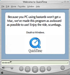
Once you have created an illusion of professionality, you must immediately ruin it. After all, honesty is the best policy. The easiest way to begin is give every sentence at least one spelling or grammar mistake. This is a must. Also another thing one should do first off is make the actual HTML very unpredictable and not standardized. This will cause your shiny site to look not so shiny 95% of the time when it is completly incorrectly rendered. Once you have done these two things, you must begin adding annoying "features." Always have a flash audio player that automatically plays a low quality version of one of your songs. Also have a lot of links that supposedly lead to interesting features, but in reality lead to missing pages or pages that don't work. For example, if you advertise that you have music videos for three songs in the Media section, make sure they all link to the same video, and that if you give them the option of Windows Media format or Quicktime, in three resolutions they all lead to Real Media format in low quality. If you want to make the site especially successful, make the actual video file you do have corrupted and/or have it require nonexistant codecs.
There are certain pages every band/artist site must have.
- News - This should contain infrequently updated news, mostly about the website having problems. At any given time the latest news post should be no less than six months old.
- Biography - The band's biography should be no more than two paragraphs and be written in broken sentences that tell nothing of importance.
- Discography - This should contain a list of everything the band has done. However it should be organized in such a way that it can't be rendered properly by the browser, or it makes no sense when looked at.
- Media - This section should contain media such as photos, videos and wallpaper. There should be one or two crappy wallpapers, neither which have the actual band logo unobscured by some photoshop filter, and pictures of the band members making funny faces which lack humor. The videos should be mislabeled and hard to find/use (see above).
Some bands will also have a link to a store where you can buy trite, cheap items containing a band logo.
Band websites should always contain a flash intro or at least a splash page saying "Enter." This is in order to make sure people who visit the site are hardcore enough to enter it once they arrive there. Many people will have second thoughts and aren't cool enough anyway. This is great for publicity.
Newsletter[edit]
Every band's site needs a newsletter. Newsletters should be infrequent bordering rare bordering nonexistant, and can be subscribed to by entering an email address in a box on the front page. A user should never be sure if they got on the list or not because no confirmation will be sent, and the acceptance page should be a garbled mess. Example newsletter (when one does arrive):
- Dear <youremail>,
- We are happy to be informing you of our newst consert! Tickets 4 our tour go on sale on saturday! We wil be prmoting our knew album so please by it!
- <a href="bandwebsite.com"bandwebsite.com</a>
- - The band
At this point in time, the user will be finally informed he is on the mailing list. After a few hours of deciphering he will also be informed that the band is having a concert.
Guestbook[edit]
Every band needs a guestbook script, preferably hosted on another site and linked to in frames. The guestbook should have a confusing layout and a bad color scheme. Adding comments to the guestbook should be hard and require the user to enter a confirmation code that is impossible to read and isn't recognized even when typed right. Lowercase "L"s and the number 1 should always look the same, and the difference between upper and lower case on any letter should be indecipherable, but required. The guestbook should be periodically purged of any meaningful posts.
Conclusion[edit]
The best band websites will use a ton of flash animations and Javascript scripts and be generally hard to navigate. The worst will be impossible to navigate. If all of this seems too overwhelming it should be noted that many bands are creating MySpaces now instead of websites, which greatly assists the craptastifying process.
